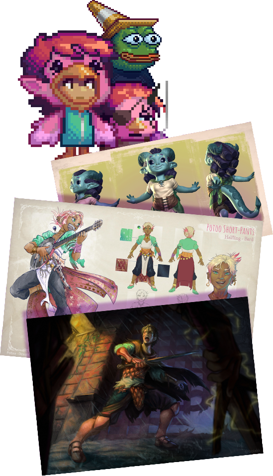
Welcome to my gallery!I'm an artist that loves delving into different techniques, with experience working with Illustrations, Character and Prop Concept, Pixel Art, Animation and Art Direction for games.
✫ Art Leadership ✫
(Do not share this link)
Art Direction, management and consulting for games.
I'm an artist with experience in many mediums and techniques, such as:
• Illustration
• Concept Art
• Pixel Art
• 3D modelling
• AnimationThis allows me the flexibility to adopt a wide range of art leadership roles, catering to each project's particularities; be it artistically, technically or operationally.
A summary of skills I provide:
• Art Feedbacks
• Visual Development
• Artistic Direction
• Documentation (briefings, art bibles, proposals, workflows, etc)
• Task creation and delegation
• Schedule management
• Presentations and alignment, both internally or with clients
• Interdepartmental communication & collaboration (with programming and GD team, for instance)

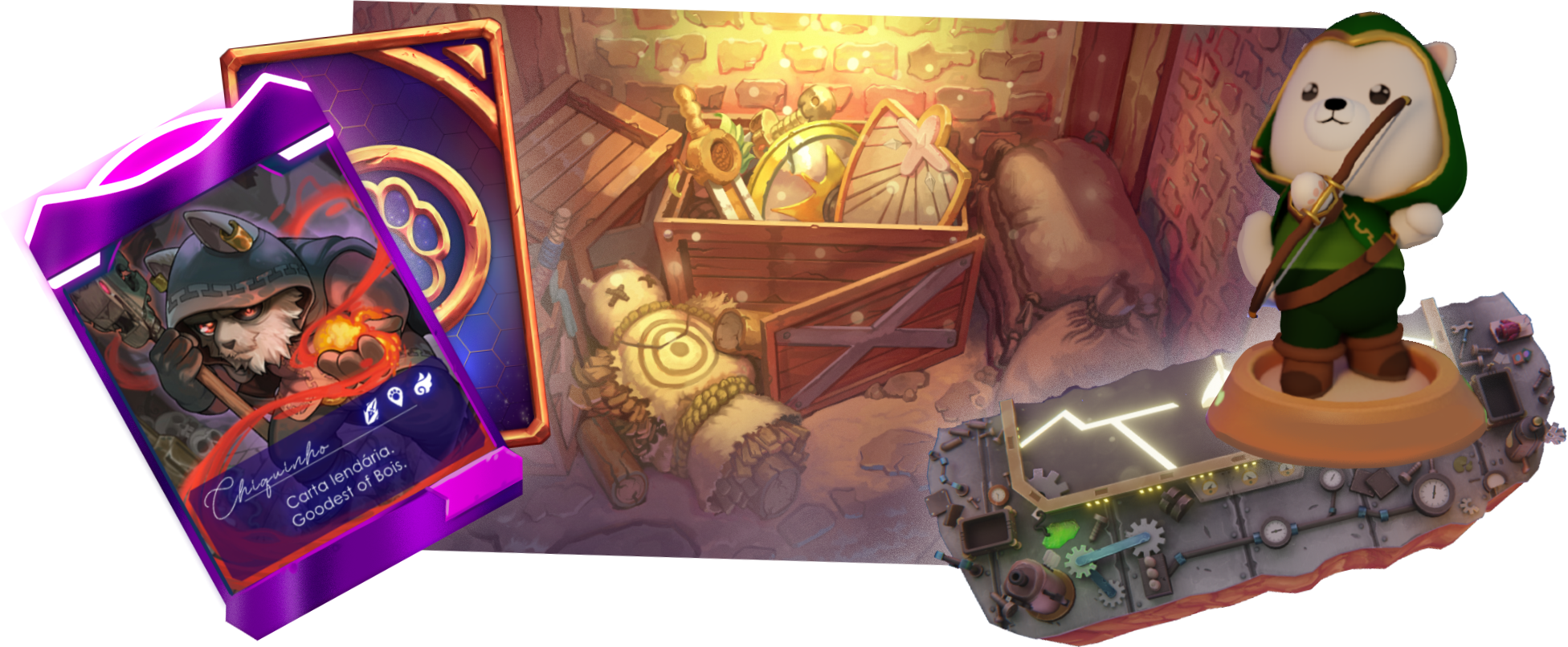
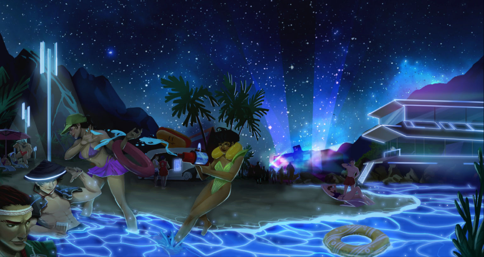
Trading Card Game
(Mobile and Desktop)• This project constitutes mostly of stylized illustration for cards, mixing a friendly visual language with cinematic staging.• My roles mostly focused on directing illustrations and giving feedbacks to them, as well as managing the art team.
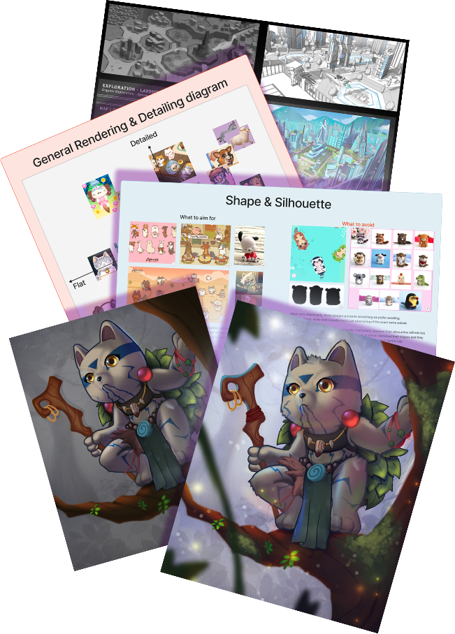
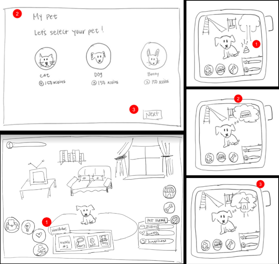
Virtual Pet-Caring game
(Smartwatch & Mobile)• A Tamagotchi-like game in which you care for and play with virtual pets, as you raise and customize them.• My role focused on the visual exploration and art proposal for pre-production
Metaverse
(Desktop)• Players would be able to interact, play, customize and expose their ideas to each other. A sandbox for both business and entertainment.• My role focused on the visual development and pre-production definitions, as well as artistic feedback and technical research.
Turn Based J-RPG
(Desktop)• A story focused game, where players would experience the cost of eternal life.• I was contacted to review their produced material, giving feedbacks and suggestions to assist in the creation of a strong creative direction.
(For more details about my contributions and projects, click on the logos)
If you would like to check my art, you can click here to visit the rest of my portfolio.
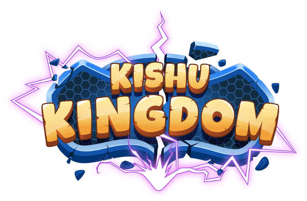
Kishu Kingdom — Trading Card Game (with NFT integration)
For Desktop and Mobile platforms
Kishu was a deck building & trading game, in which players could compete online, and had progression in the form of unlockables; different Avatars and skins, abilities, cards, arenas, as well as integration with NFT's linked to specific cards and perks.This project was originally directed by a colleague, who was responsible for the entire project and set its guides and directives. I got into the project halfway through, to help manage the team that was having difficulties keeping the desired quality and delivery pace.
I became responsible for 2d art and animation, focusing on reviews and feedbacks, as well as directing the creation of new card illustrations, while my colleague kept focused on 3d and UI/UX.
My responsibilities were:
• Closely lead and manage a team of up to 15 artists (mostly composed of junior)
• Create, organize and delegate tasks
• Validate art production
• Create detailed feedbacks, doing paint overs when necessary
• Direct new card illustrations, in collaboration with game designers to create a cohesive narrative
• Create and refine documentation (art guides, briefings, workflows, presentations, project resources, etc)
• Review animations
• Implement new card assets within unity
We could summarize Kishu into the following elements:
• Arenas (3d and 2d)
• Pets (3d)
• Illustrations (screens and splashes)
• Card Illustration
• Animation
• UI/UX
Kishu's story was about different worlds that would clash together, sending their champions and helpers to battle. Each world had a different theme, such as "lost world", "steampunk", "fairy kingdom", "space adventure", etc.Those themes were reflected on illustration narratives, arenas appearance, avatar customization and more.
An interesting aspect of this project is that the art style for cards wasn't too strict. Instead, individuality in style was incentivized (to a certain degree), as long as cartoonish proportions were used, had "friendly" designs, and the card frame was respected when composing the illustration.
Below are a few of the cards I have directed and assisted in the creation:


My biggest influence was bringing a more "cinematic" feeling to the illustrations, showing how we could synergize "cuteness" with an "epic" coating over it, but still keeping it's identity.
The following cards on the right are from before I joined the project:


Being composed mostly of junior artists, a lot my schedule was dedicated working closely to them, with directives, validations and feedbacks.
Kishu was a fast-paced project, with deadlines between 1 and 2 weeks.
This incentivized to push the core aspects of what makes a composition interesting, while keeping it relatively simple.
Below is a showcase of arts before and after my feedback.


A fun concept we came up alongside the game designers, were "matching sets". Cards that would complement each other, be it narratively or even forming larger pictures, which would synergize should they be played together.Here are a few examples of shared narratives/themes I directed:


Following, here are card illustrations that pieced together formed a bigger picture:


As part of the customization, the card's backside were based in the different "worlds" in the game (such as steampunk, space adventure, lost world, etc).
This is but one of the ways players could personalize their experience!


Bellow is a gallery of splash arts and screens from the game:


GoPet! — Virtual Pet App
For Smart Watch and Mobile platforms
GoPet! was a companion app meant to be released alongside a new brand of smartwatch. In it, you would be able to raise, care, play with, customize and acquire pets, allowing interactions with fellow GoPet! players in the vicinity, such as mini games and augmented reality photos alongside your pets.This app was aimed for a young audience and their parents, as it would be linked with health monitoring functions, such as Samsung and Apple Health, incentivizing a healthy routine for young players, while allowing for parents to check in real time the wellbeing of their children.We were tasked to develop the blue-sky stage, exploring concepts to create the necessary definitions for pre-production within around 40 days.
My responsibilities were:• Analize the client's objectives and develop concepts that would fit it, both thematically and mechanically
• Create early explorations, guides and documentation to cement the project's base and future art-bible
• Align ideas and expectations with clients
• Closely work with Game Design and Programming team to assess technical viability and user-experience usability (such as how the character models would be created and implemented, how the customization system would work, etc)
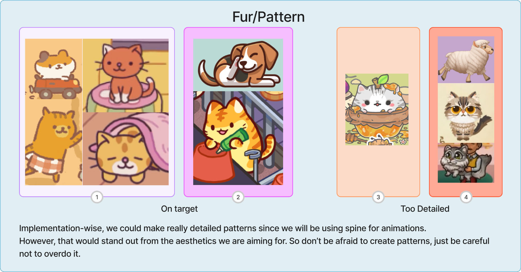
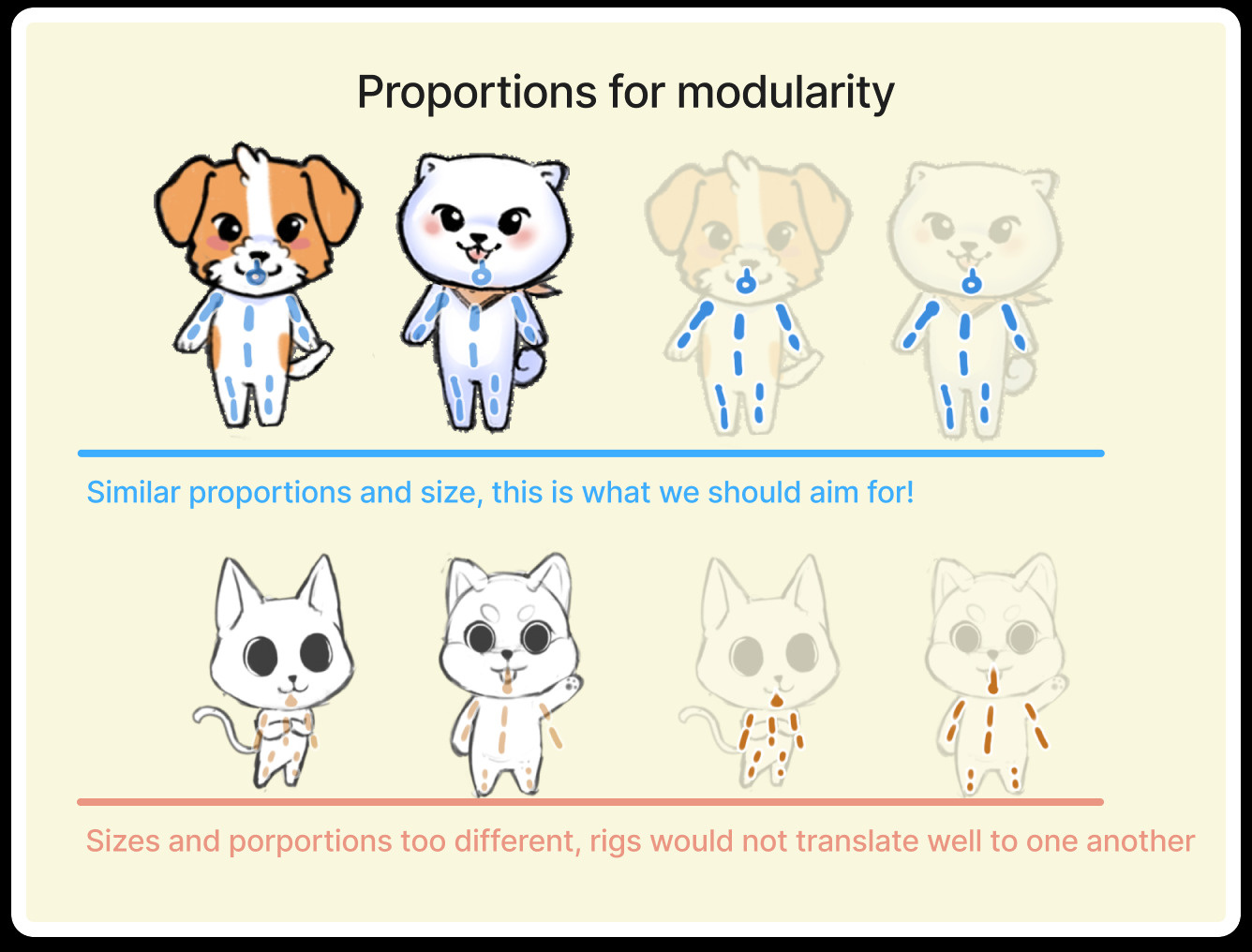
• Plan production to fit the required tools (e.g: guaranteeing modularity so we could animate with Spine)
Before starting, we received a briefing of what the client imagined:
Players would be able to adopt different animals (starting with cats and dogs), customizing their breed, clothing and appearance.
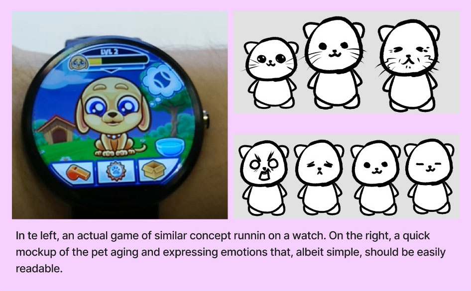
They would be very expressive and grow, going from a pup to an old pal.This presented a technical necessity to adopt puppet-style animations in order to create modularity, which allows for better scalability.Examples of puppet animation from various sources:


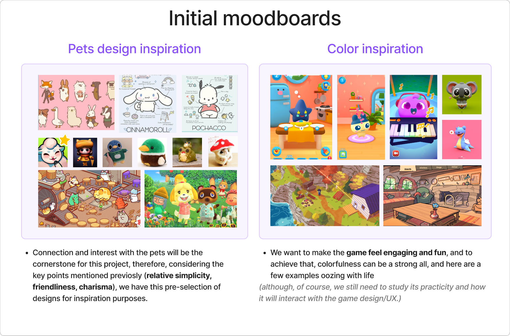
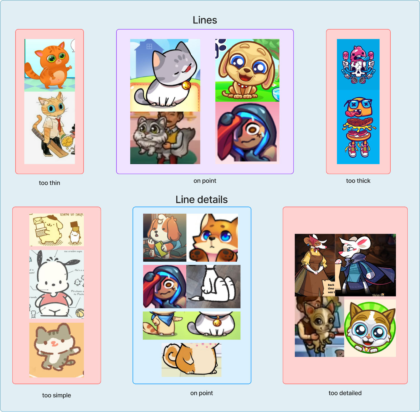
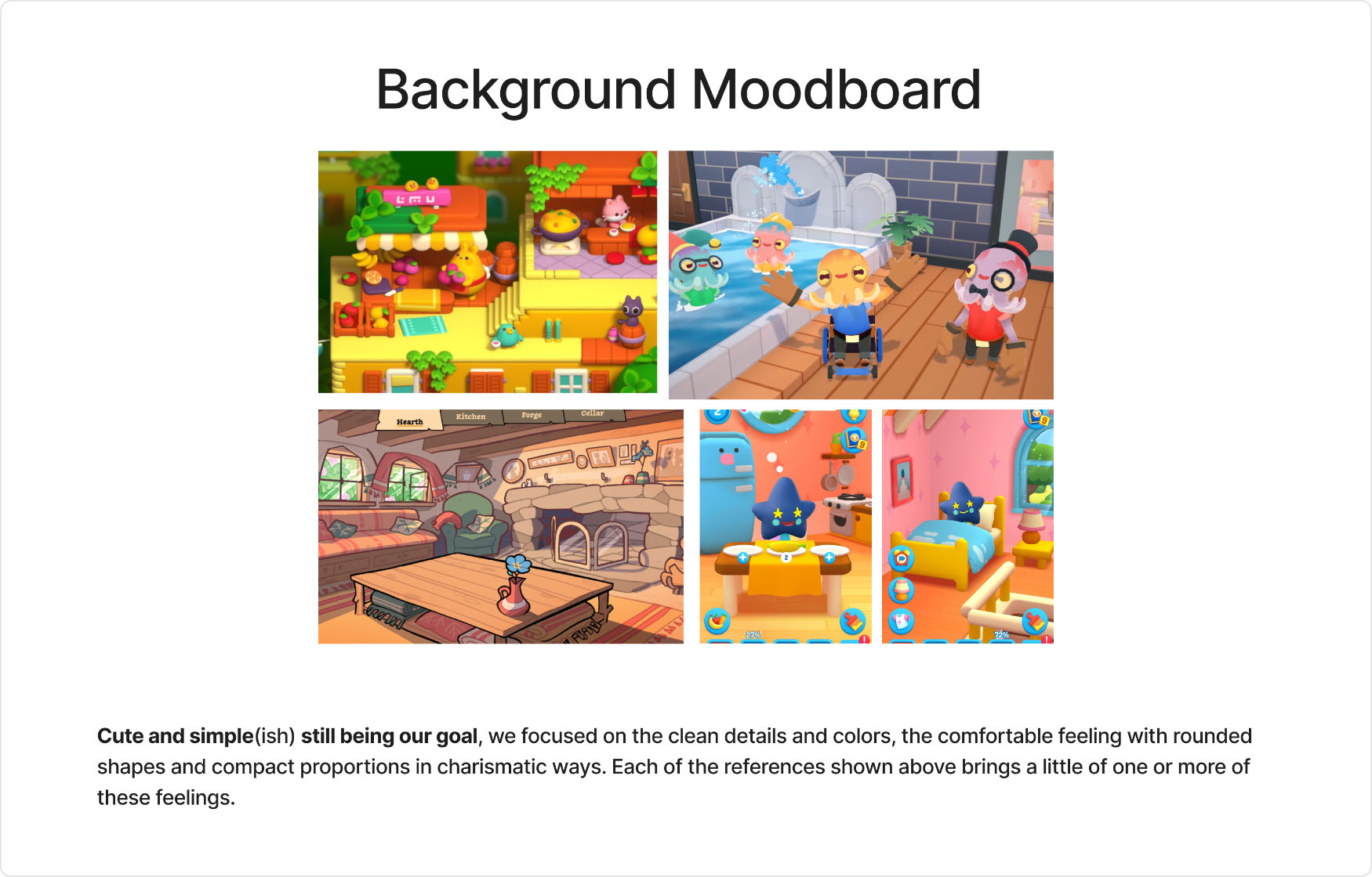
We gathered references for games with simple, charismatic, and vivid styles. Based on them, we filtered a few possible "paths".
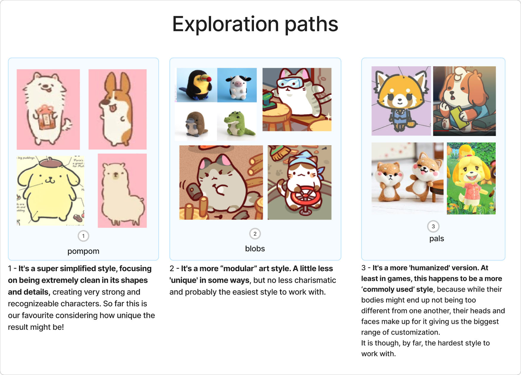
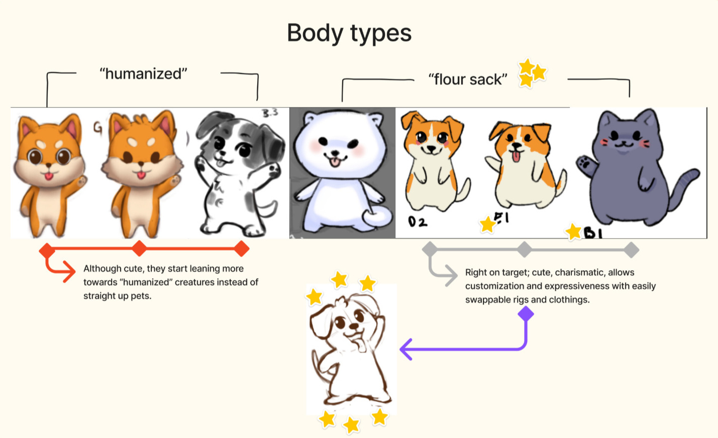
We knew from the start that we would be using Spine to reutilize the skeletal animation as much as possible, so even on early explorations we focused on creating easily-customizable and/or swappable animals.Below is the created explorations based on the exploration paths shown above:
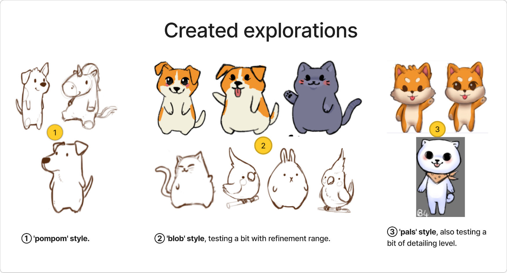
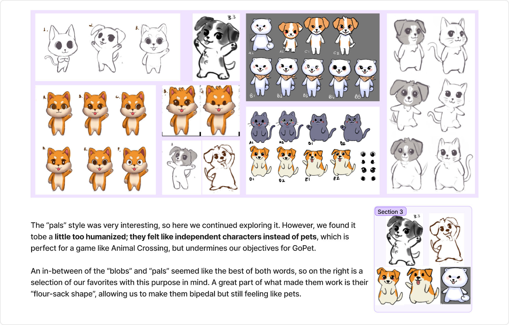
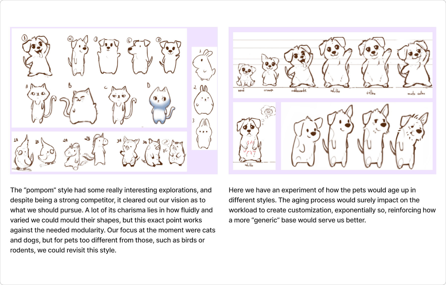
Due to the probable skeletal differences that would happen from one pet to the next in the "pompom" style, "blob" ended up being the winner, having the best of both worlds.
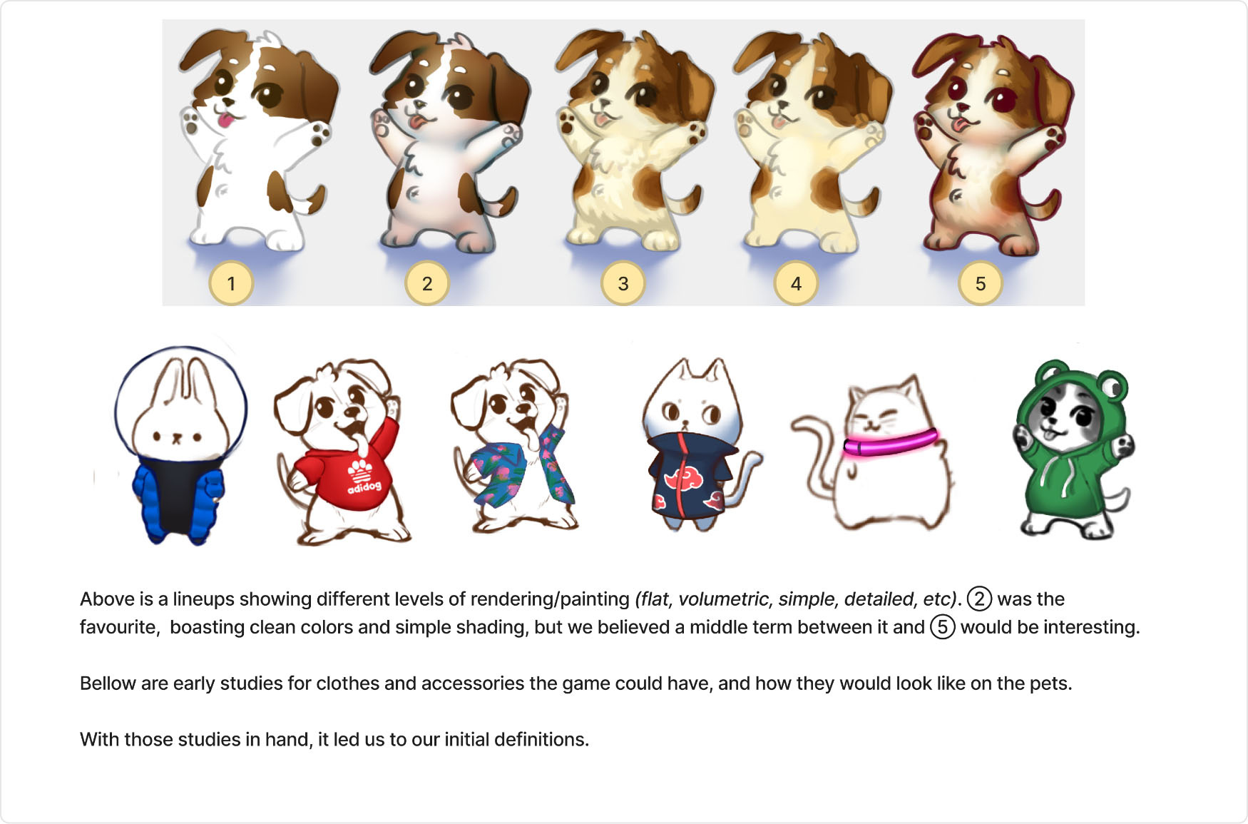
With these explorations on hand, I was able to start solidifying a direction for the pre-production. It was still not set in stone, but would already be a stable ground to navigate.
With the characters explored, it was time for the backgrounds!We started looking at stylized references, such as other virtual pet games and Moving Out, which has a really clean aesthetic close to what we wanted (despite its colors being a bit more vivid than our aim).
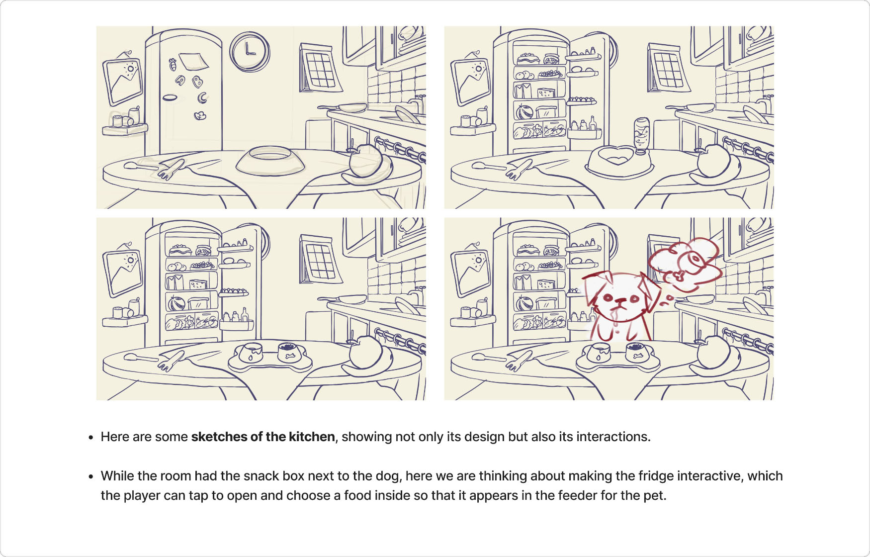
And here it is, our final mockup!
UI would be implemented at a later time, as it was being done in parallel.
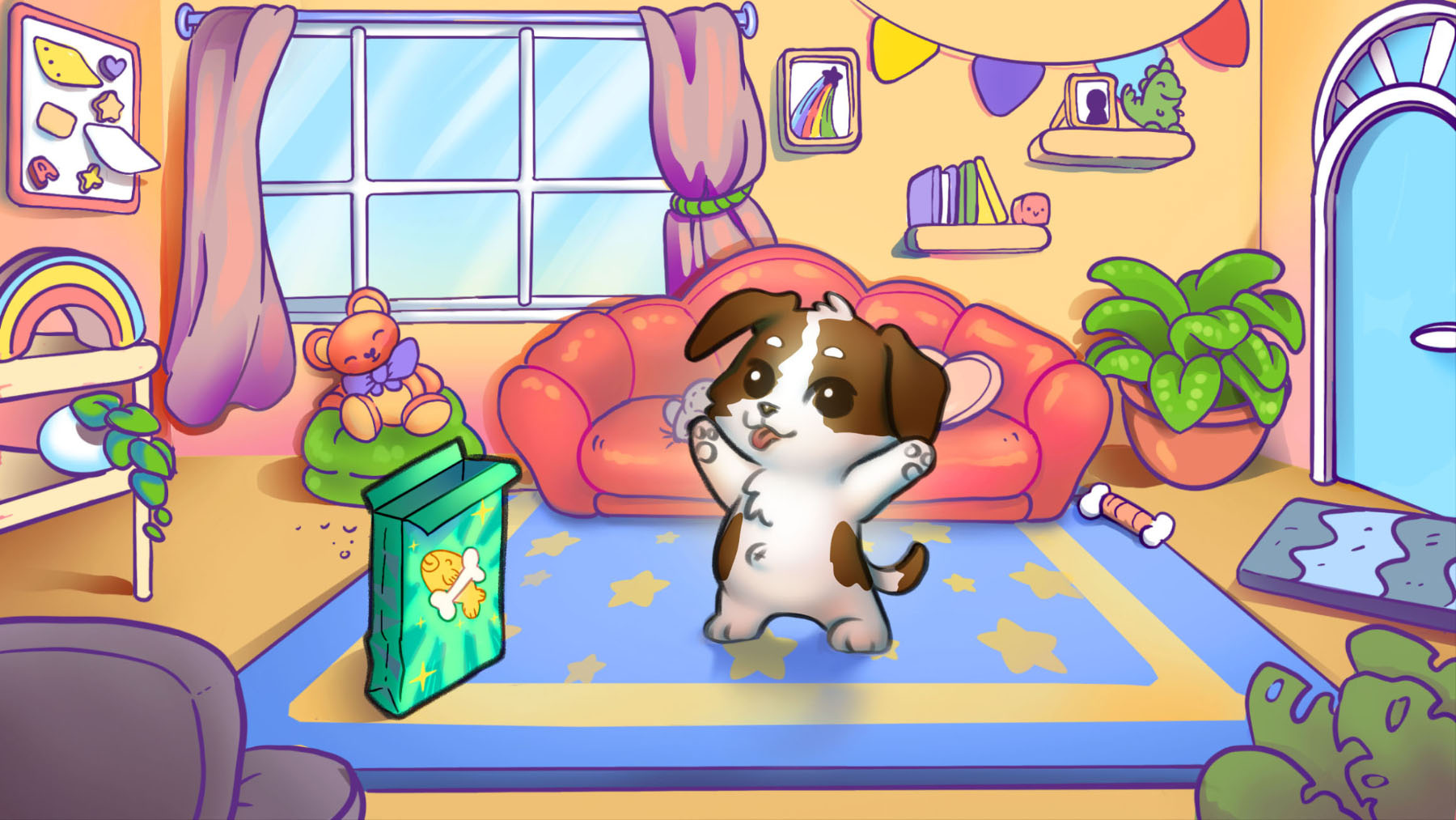
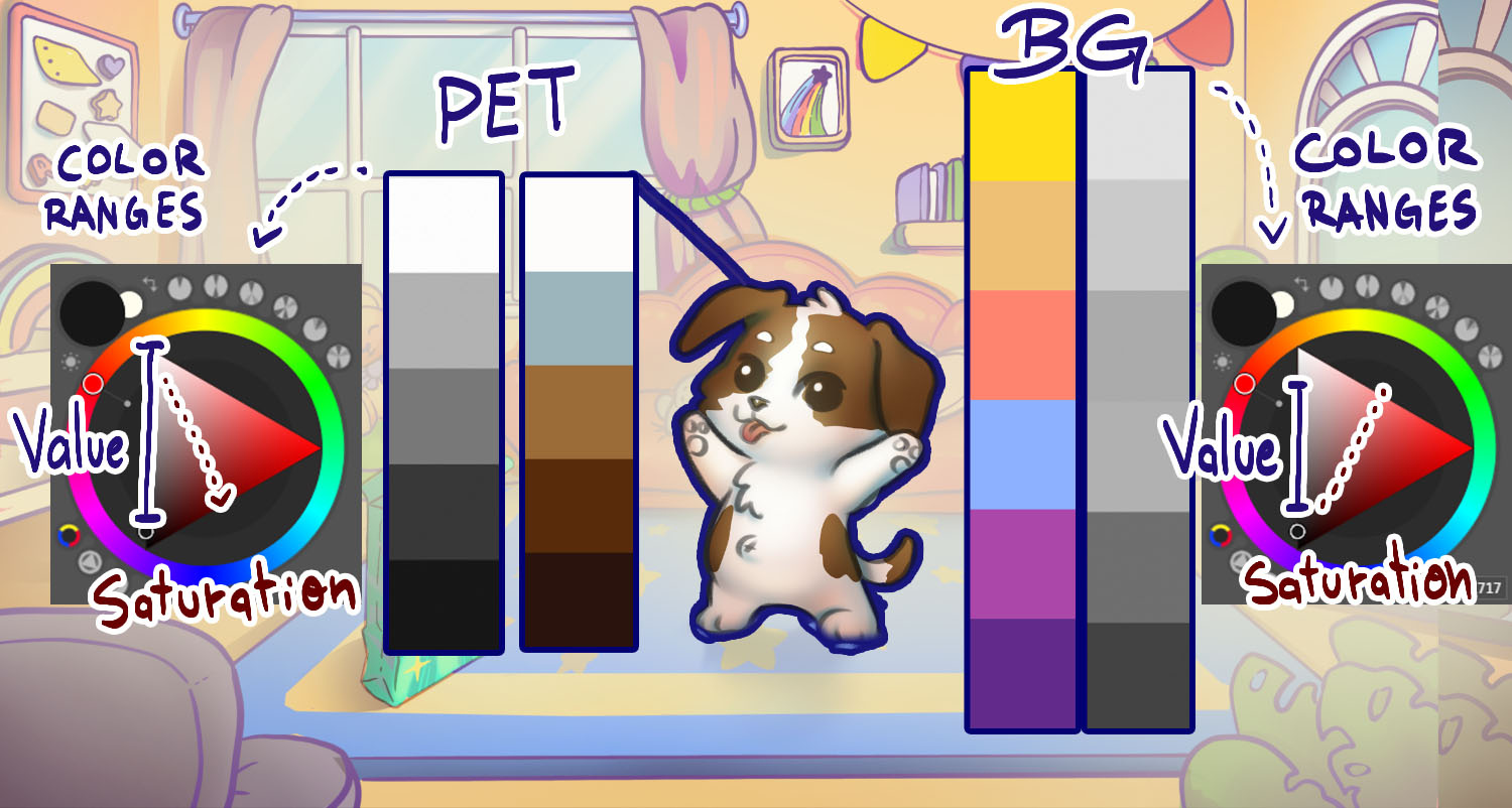
But this final test helped us push further into solid definitions:
The color pallete for the character boasts a very wide value range, while keeping the saturated colors mostly for the dark areas.
Meanwhile, the BG pallette is the opposite; a smaller value range to create a readable hierarchy between elements, while having its lighter colors more saturated and shadows desaturated.This allows us to have a vibrant game, while trying to avoid extremes.
And, lastly, a simple mockup helping visualize how the AR functions could look like.
It is a bit odd seeing a 2d projection like that, yet at the same time oddly charming. This ended up being a case in which the dissonance enhanced it's uniqueness.
And that was our early explorations and development for GoPet!

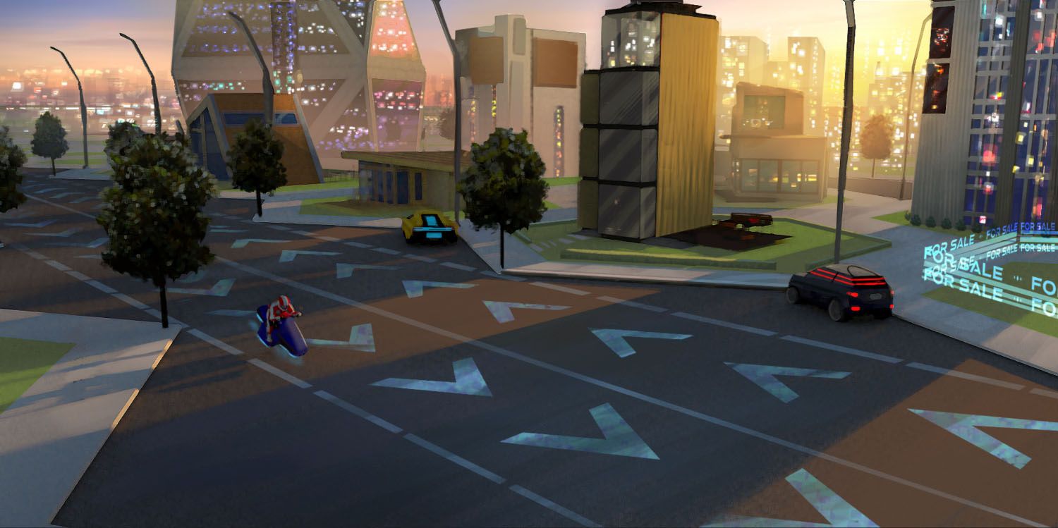
xSpectar — Metaverse (with NFT integration)
For Desktop
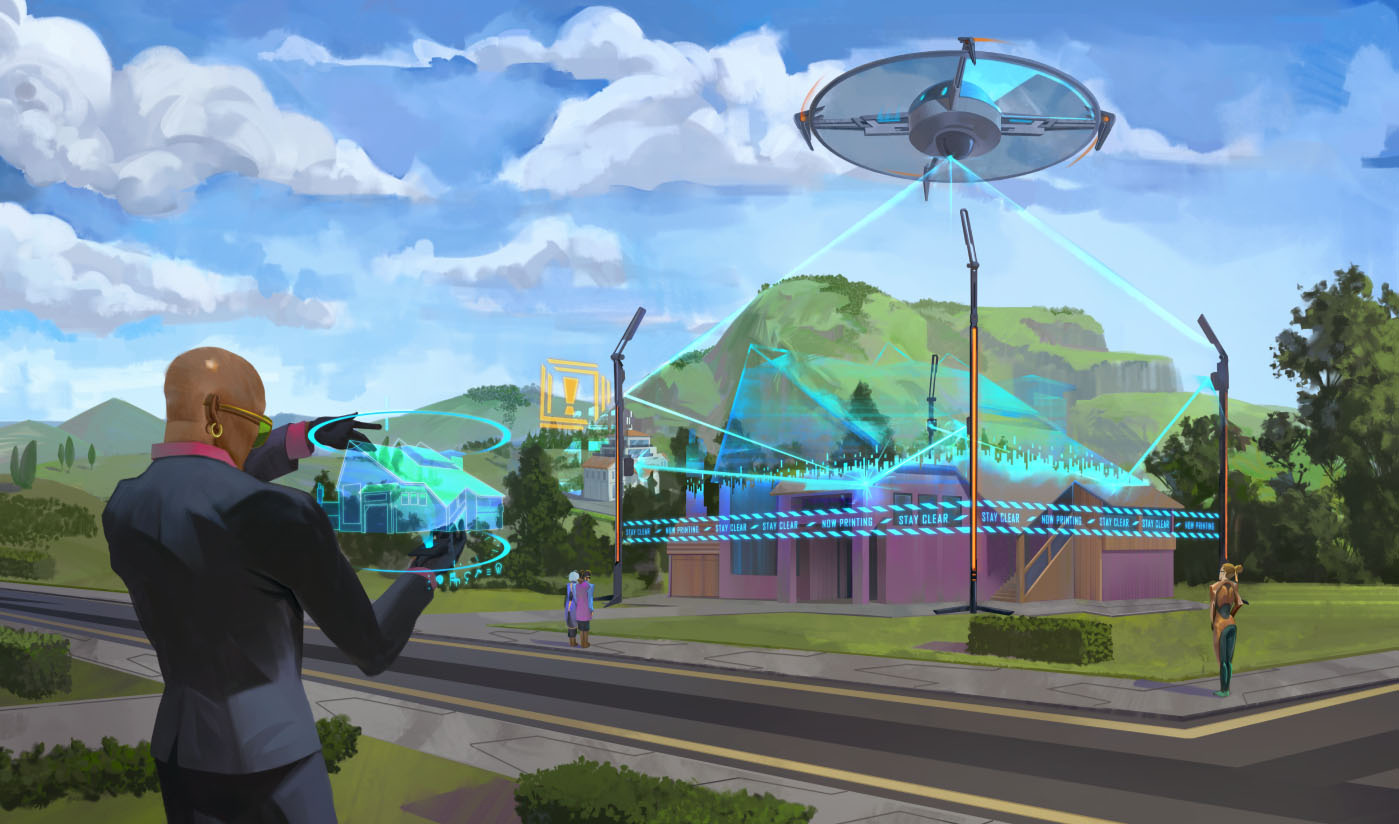
This project hosts a futuristic metaverse, with realistic graphics and a slight influence of solar punk, creating a mixture between modern and natural sceneries.Players would be able to purchase plots as NFTs and build in those lands. Recreation, business utility; you name it. xSpectar aimed to create a hub for them all, serving as an expression venue for those purchasing, and social gathering for everyone willing to participate.
xSpectar aimed to have a "realistic" availability, requiring the plots and buildings to have correct measurements.Therefore, this project was highly focused on city architecture, map planning and ambiance studies.
We could summarize xSpectar into the following elements:
• Plots & Land planning
• Architectural aesthetics
• World ambience
• Buildings explorations
• Interiors aesthetic explorations
• Interiors blueprints
• Character clothing and customization
We inherited some previously created assets for this project, which we were asked to review and refine; salvage what is possible, rework what is needed.
So our role would start from this early conceptual revision, cementing a visual identity, and would extend to late production.
My responsibilities were:• Based on the creative directions, formulate an artistic proposal for the project
• Based on the proposal, explore and develop the project identity
• Guide the creation of promotional material and key arts to shape xSpectar's world and community
• Closely work alongside Game Designers and Programmers, aligning artistic and technical needs.
• Help project managers to plan and coordinate the production
• Act as the art team liaison, executing all art-related communication with the clients
• Transform explectations and objectives into tasks, delegating and managing them
• Create artistical direction documents, quality targets, and detailed workflows
•Validate and give feedback for the created arts
• Help research tools and techniques to apply on the projectI worked alongside a colleague Art Director, whom we helped each other with documentations and organization, but I focused on 2d creations while she focused on 3d production.
A few examples of how I guided explorations:
(click to enlarge)


(note: all the art presented in this document were produced under my direction. The scope of this project was quite big and challenging, ranging from illustration to technical drawing and mechanical planning at times)
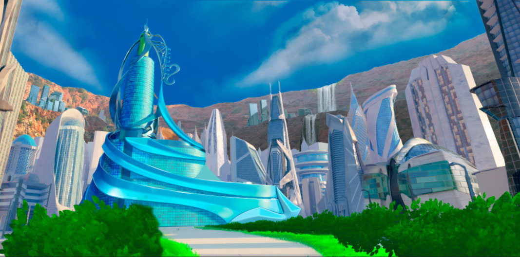
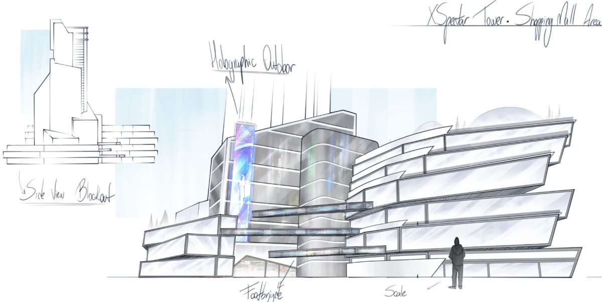
After analyzing the project's initial ideas, we came with the following pitch (on the gallery below). It focuses on the xSpectar Tower (main hub and building for the game), shopping mall (part of the xS Tower) and the overall city aesthetics.
You can click on the images below to check the entire proposal, but in summary our proposal was:
• Elegant
• Clean
• Polished
• Well kept greenery


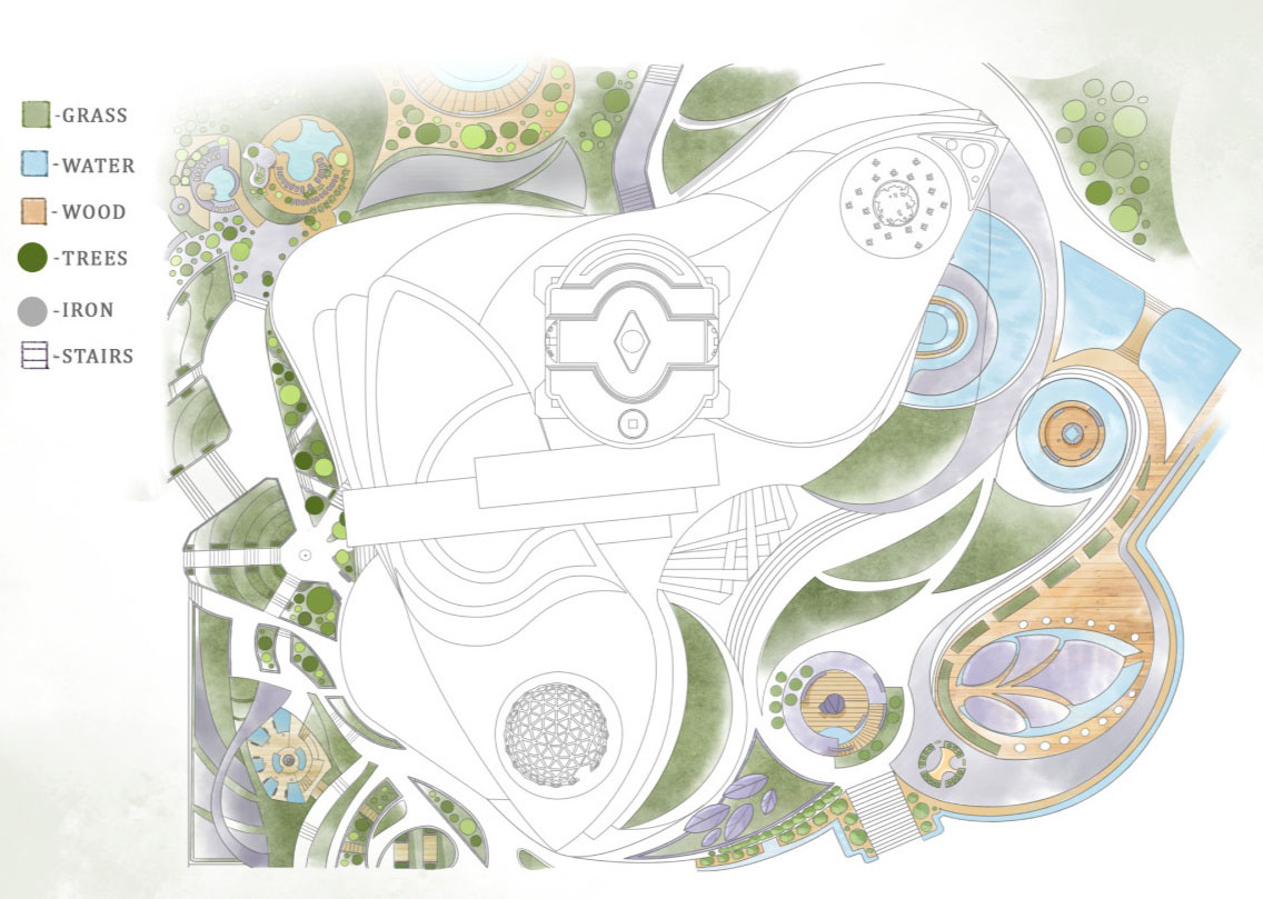
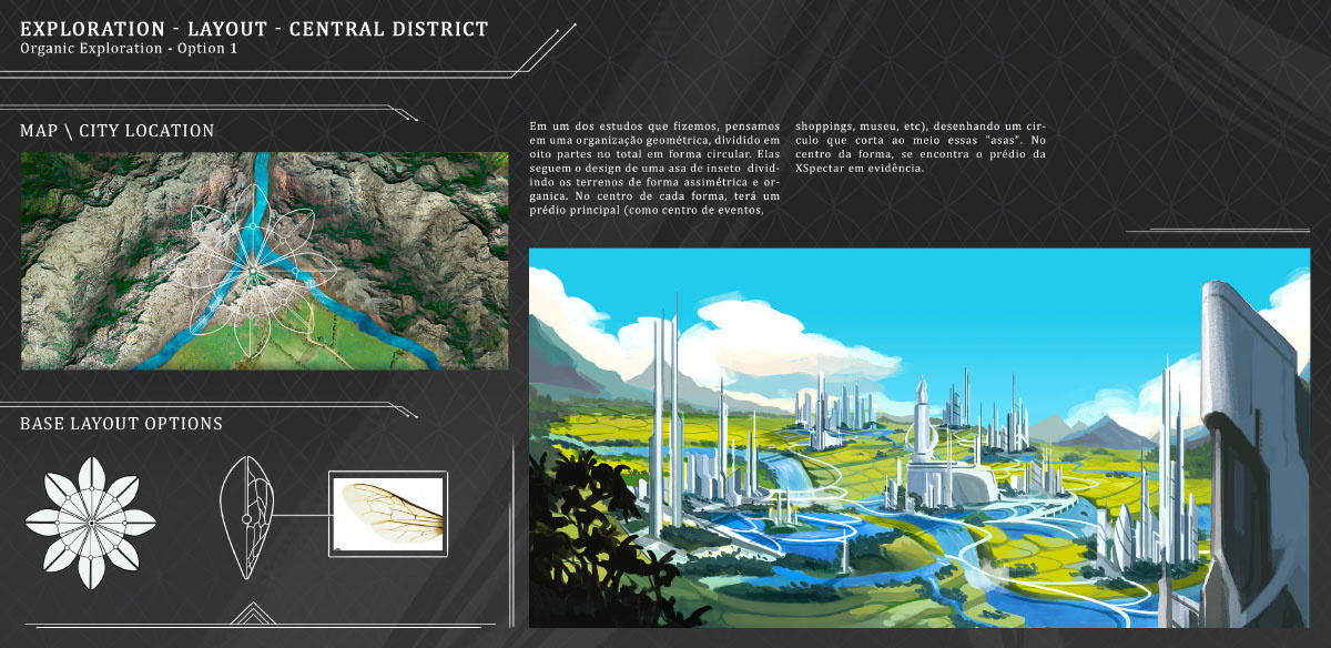
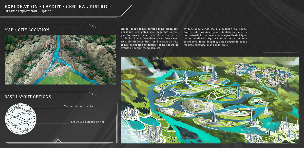
With the overall aesthetics approved, the first subject needed to be tackled was how the land distribution would work.
Should we work on grids? Puzzle-like pieces? Empty spaces that are slowly populated by domes?
"Empty boxes" waiting to be purchased and customized? Would it be built upon towers or even floating islands?
Early, we focused our explorations to this question, working alongside game designers as this would heavily impact the user experience.
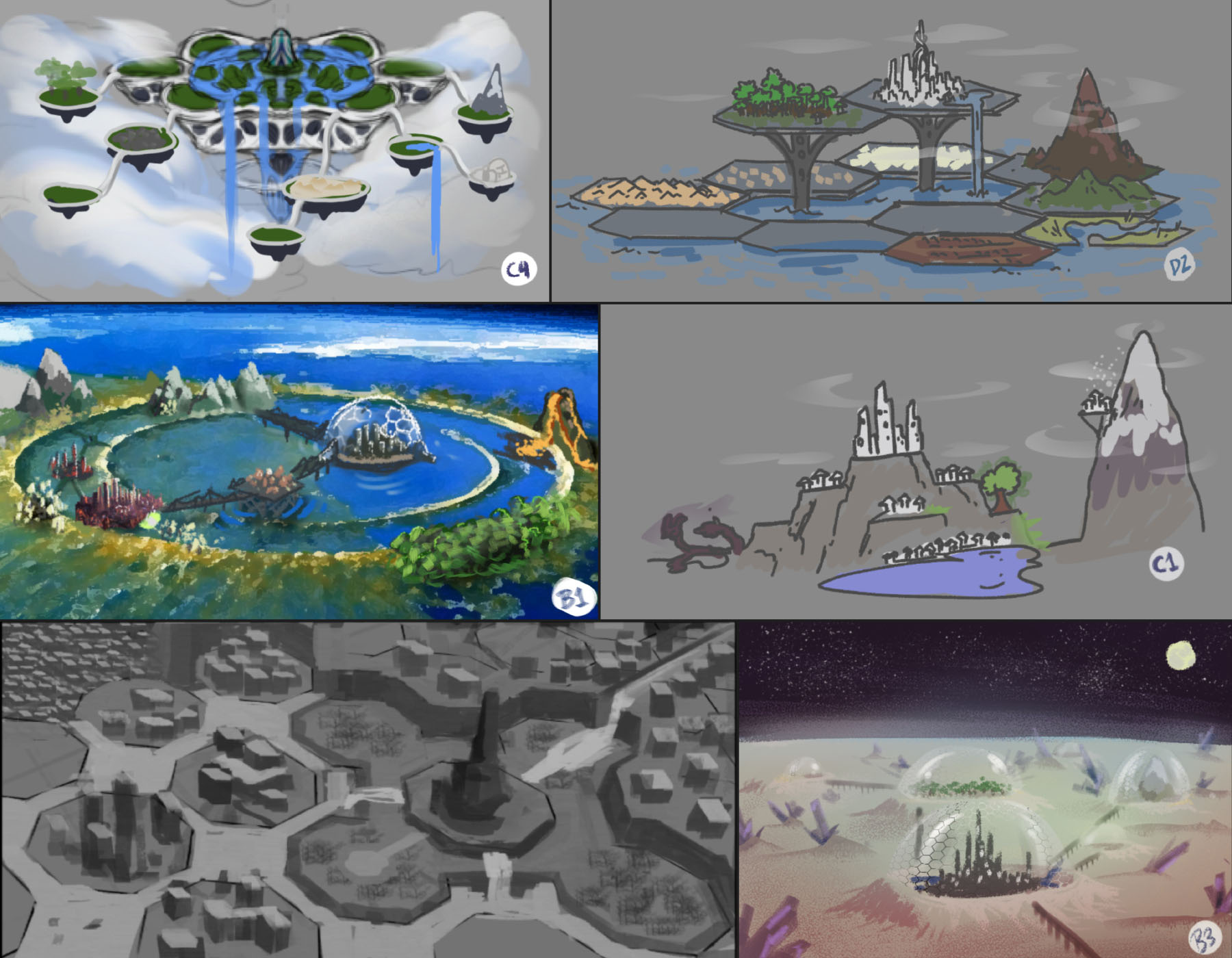
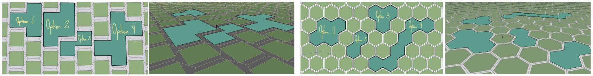
The specifics remained open, but we did opt on a more "realistic" approach. E.g. There could be markings where plots would be selling (like holograms and such), their delimitation could still be oddly shaped, but the land itself underneath it would be just regular terrain instead of "puzzle pieces".
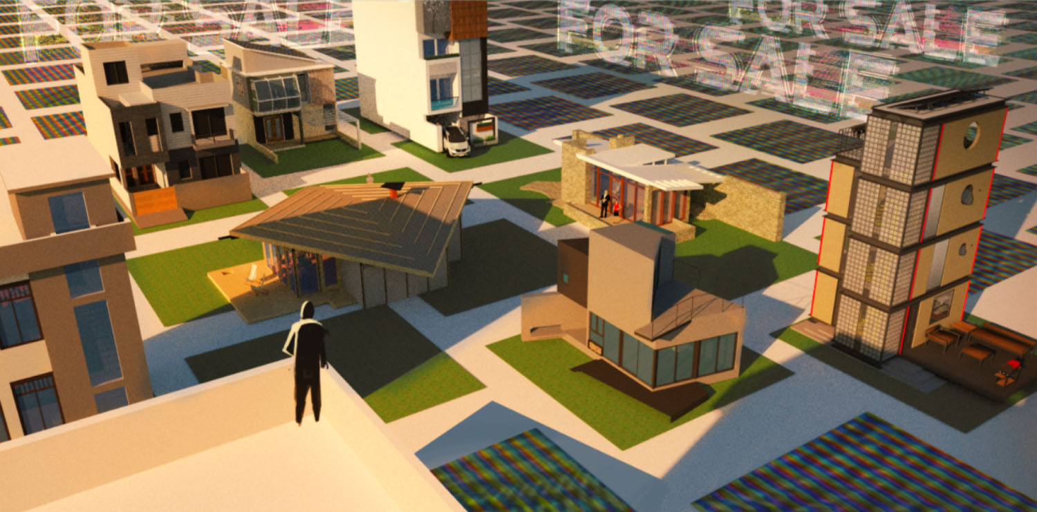
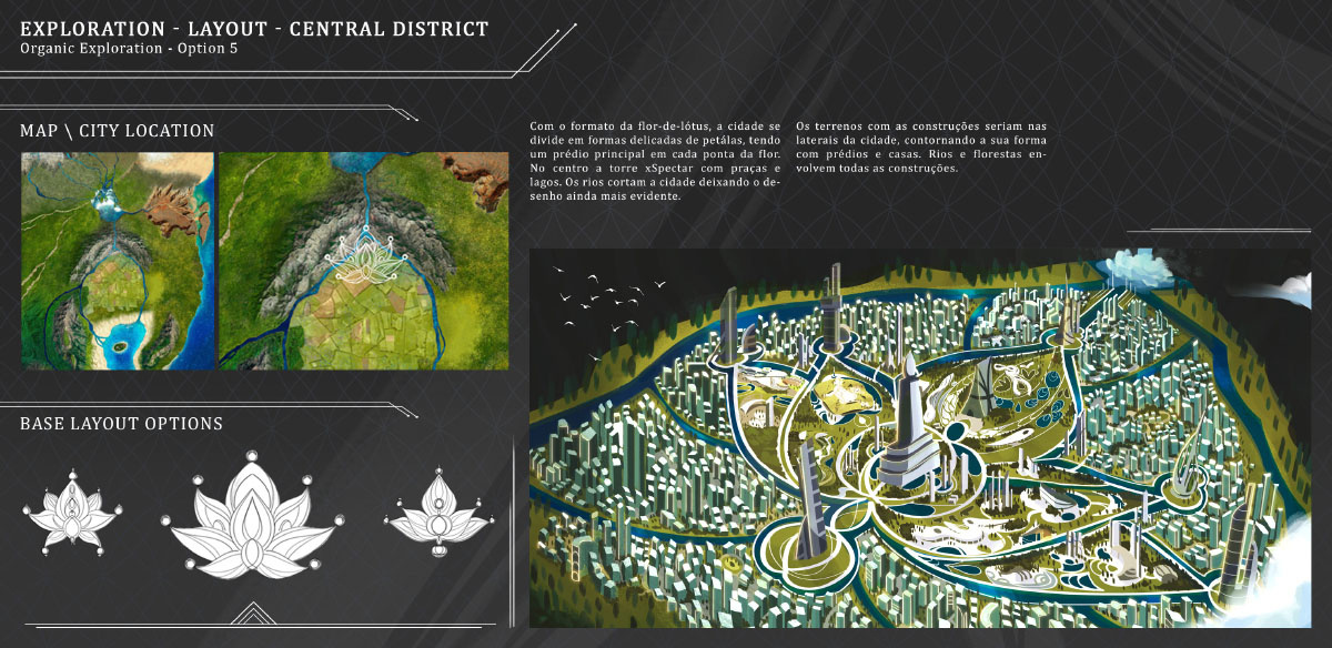
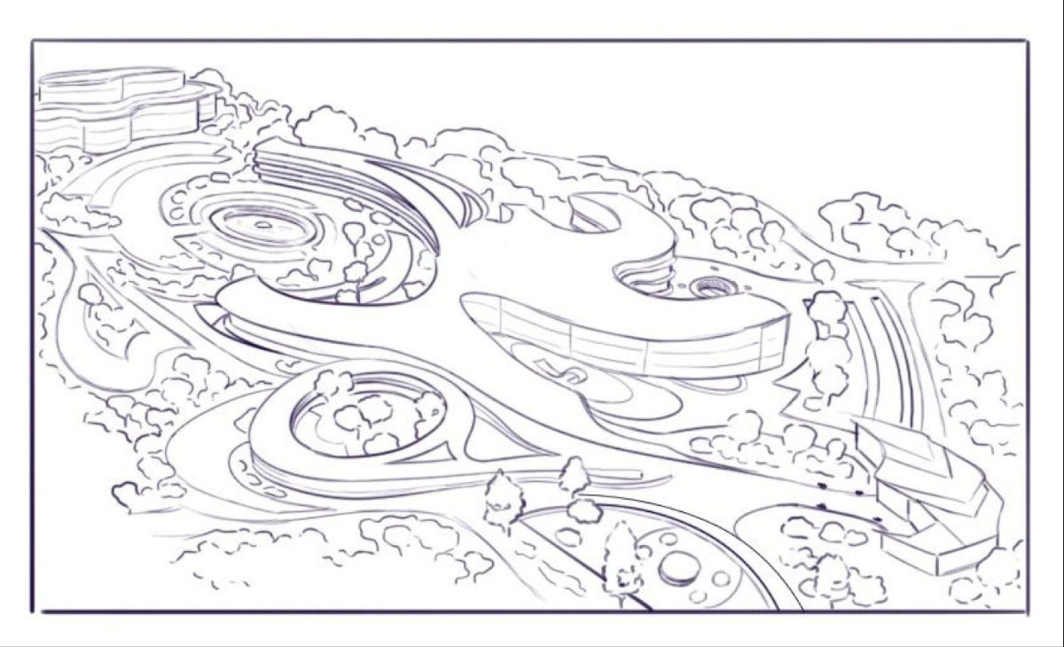
This reflected on the map's development, as we did play with "cartoony" shaped islands at first, but ultimately opted for a "grounded" design, leading us to create this continent's corner.
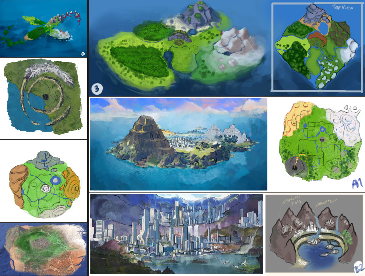
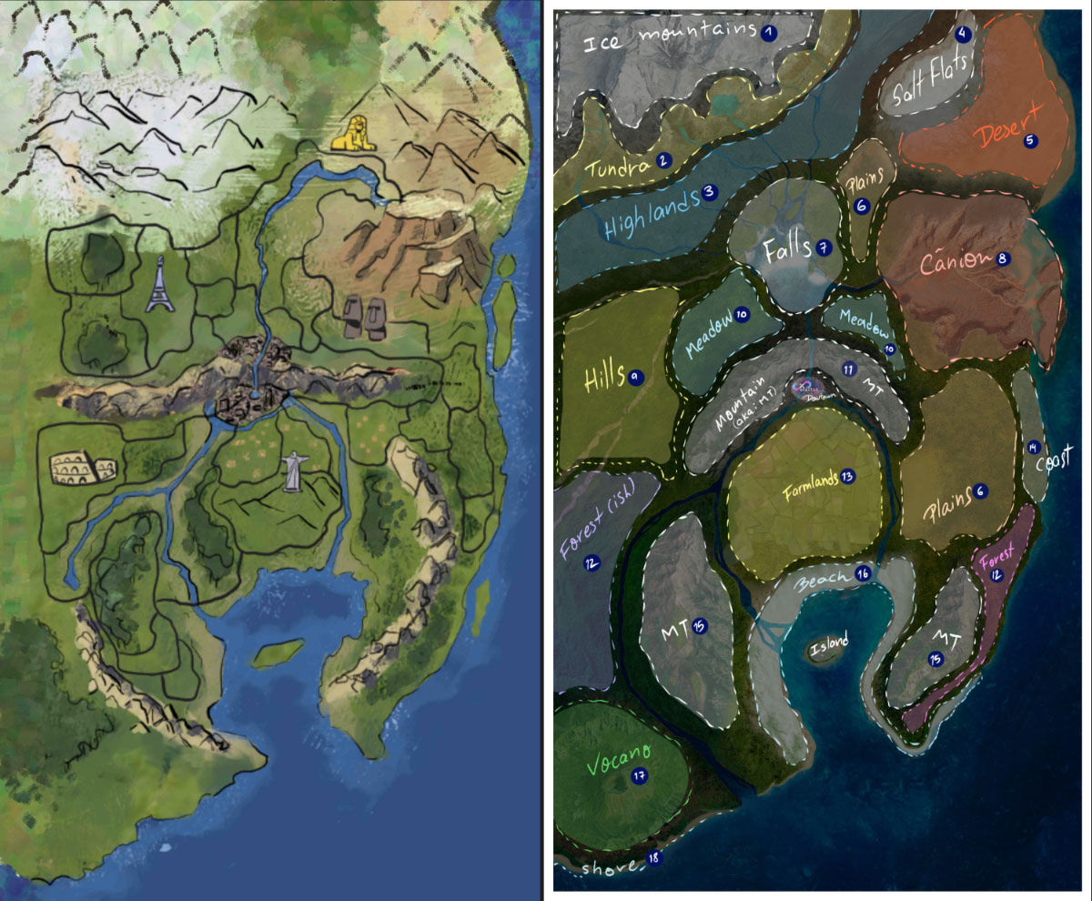
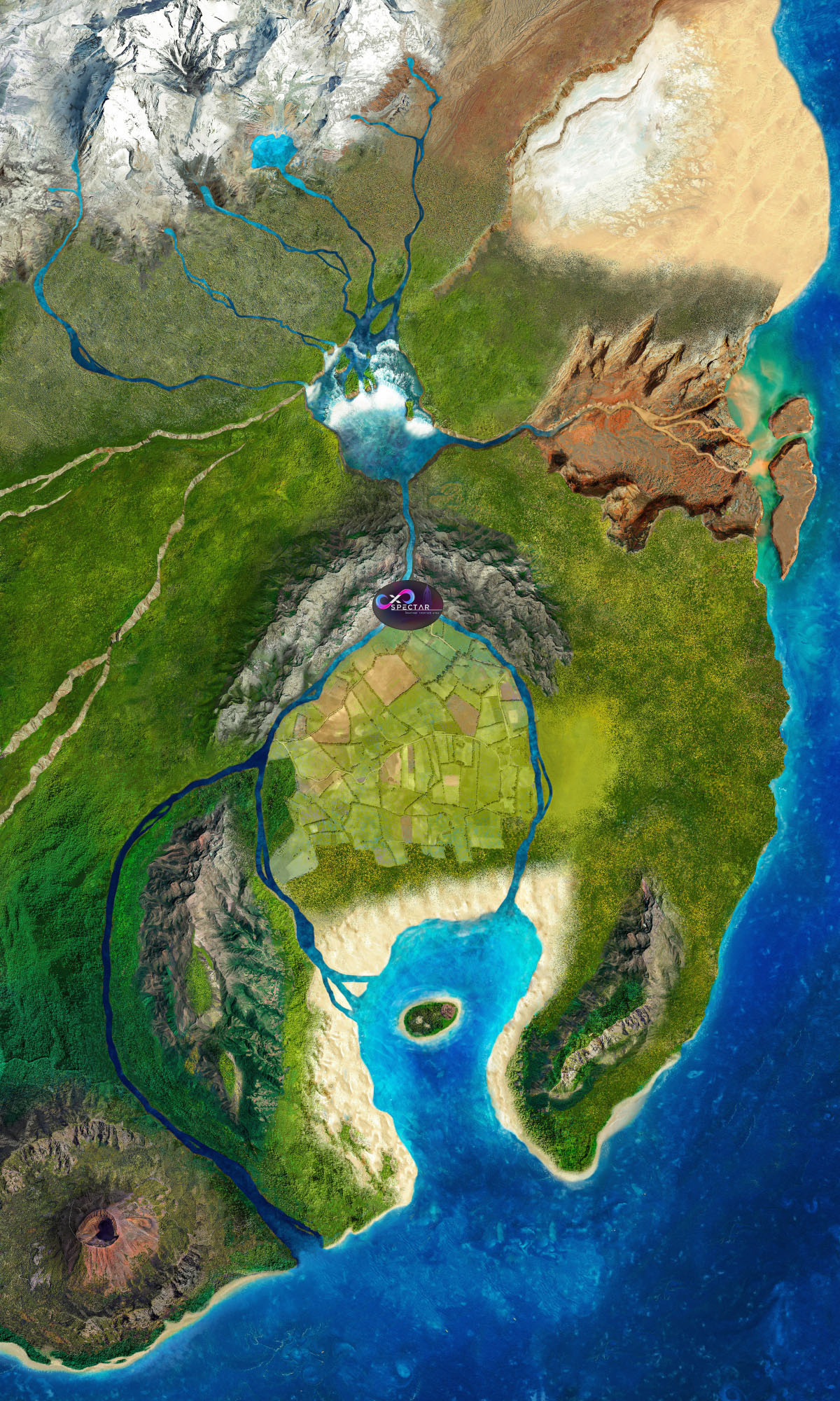
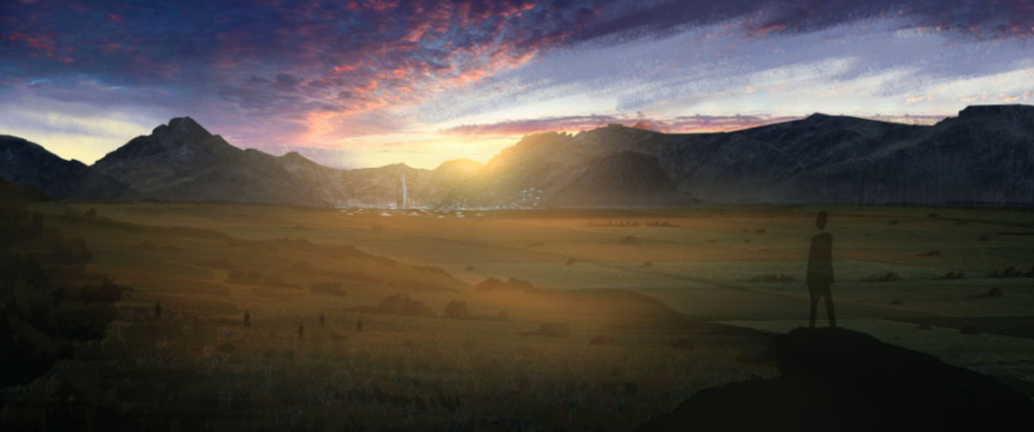
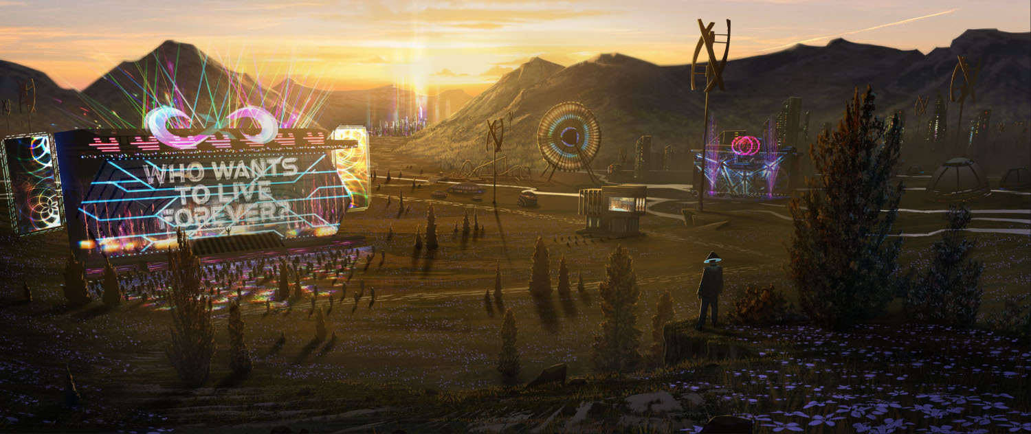
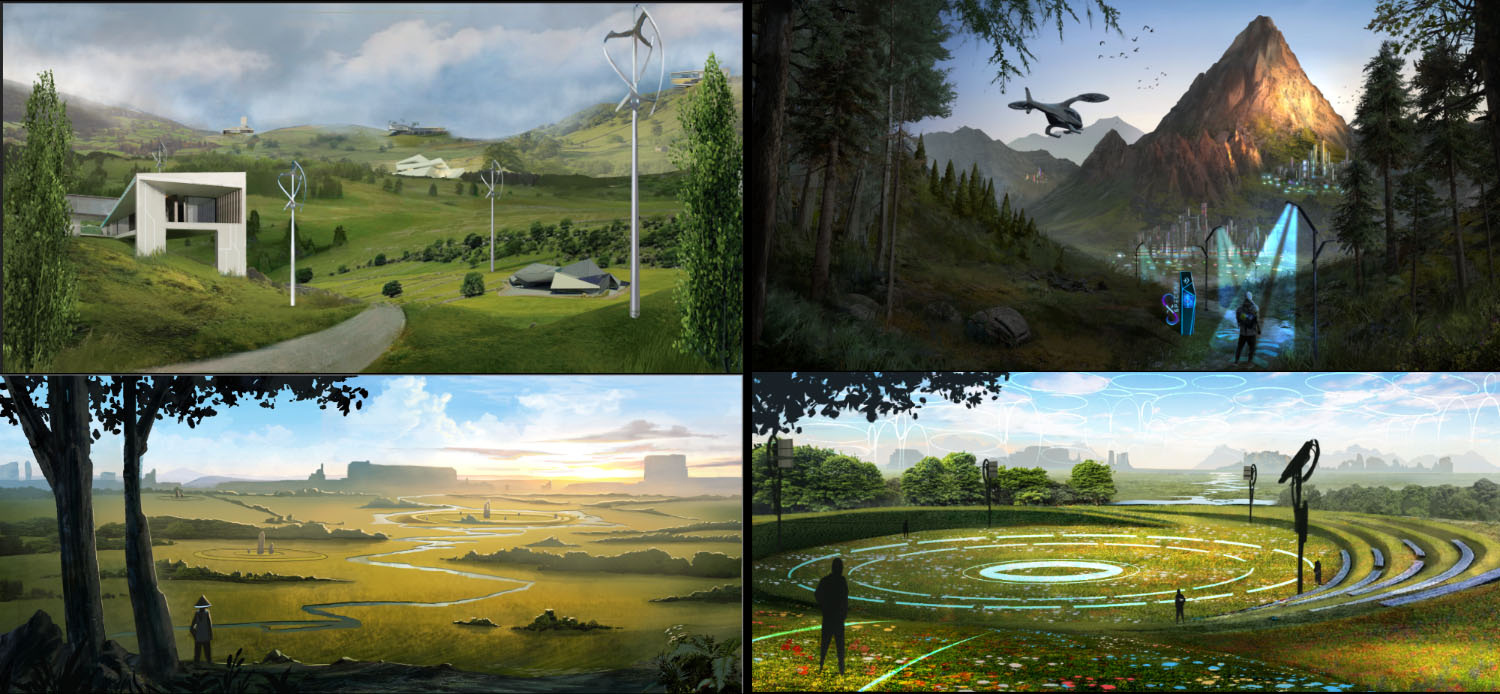
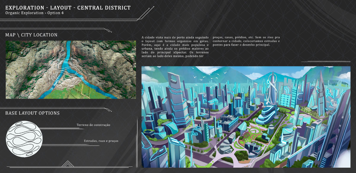
Within the map would be different regions and biomes, with the world's wonders scattered through them, serving as landmarks for player cities.So with those pre-definitions on hand, we started diving into landscape illustrations reaching for the right mood for the project, recreating futuristic landscapes that coexist with natural wonders, such as the salt flats, niagra falls, pyramids, etc. The creative direction's idea was to represent a society so advanced that they were able to terraform and preserve such wonders in a completely different geography compared to the real world.
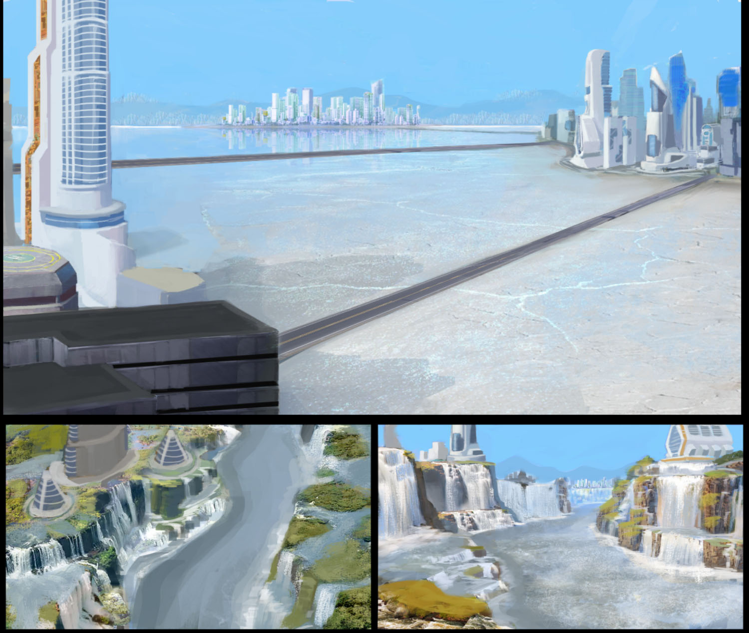
Below you can check part of the process of developing this type of art; from thumbnails, to the artist's rendition on the right, and the final version after feedbacks on the bottom:
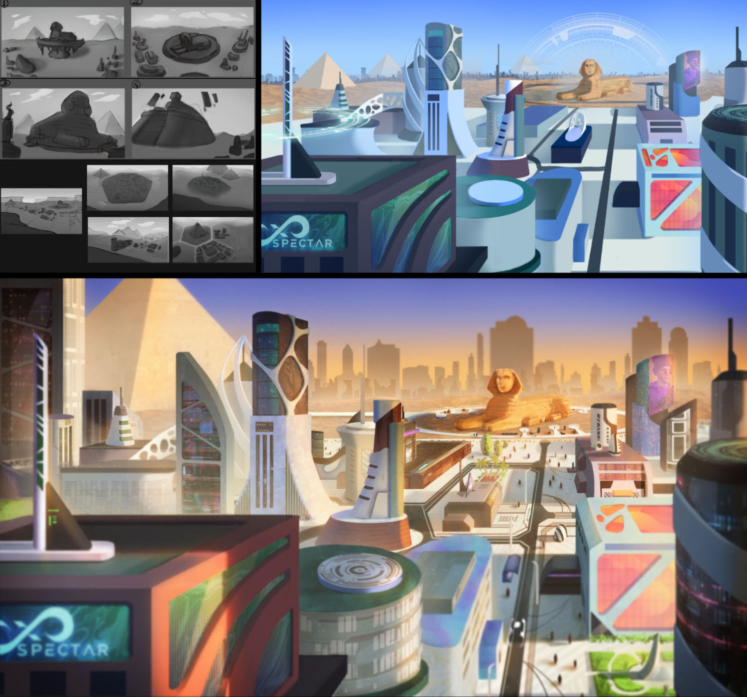
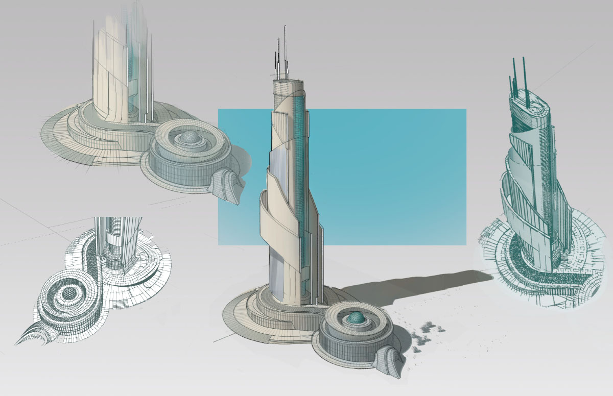
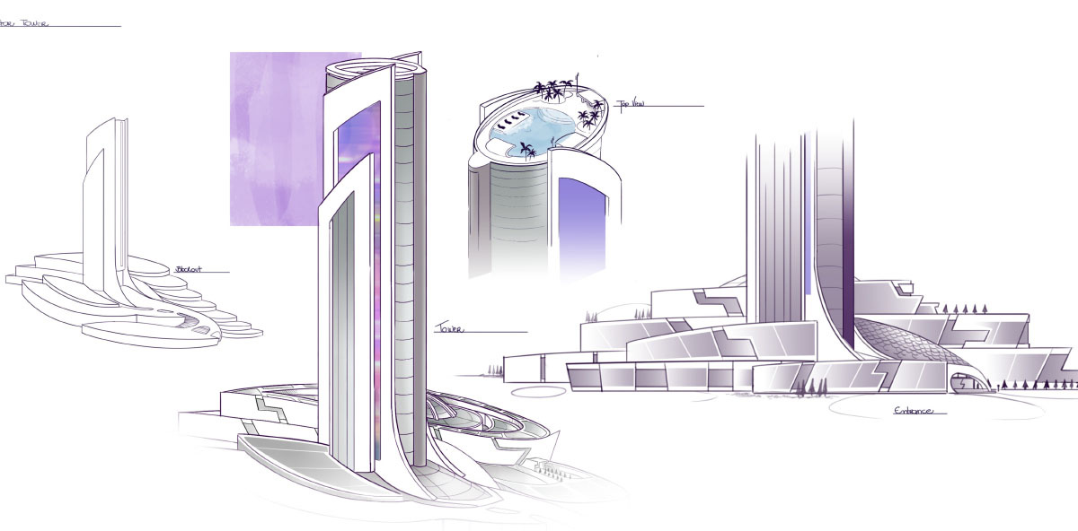
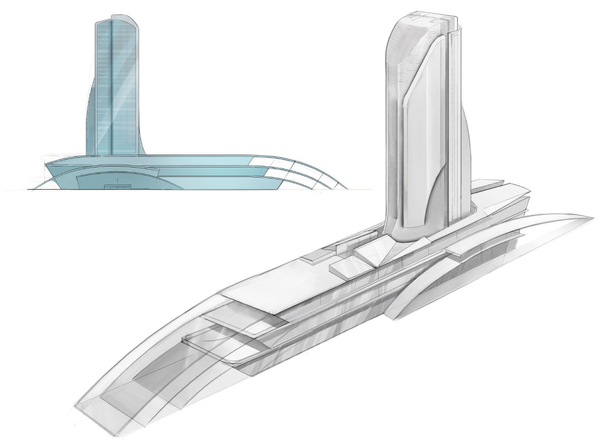
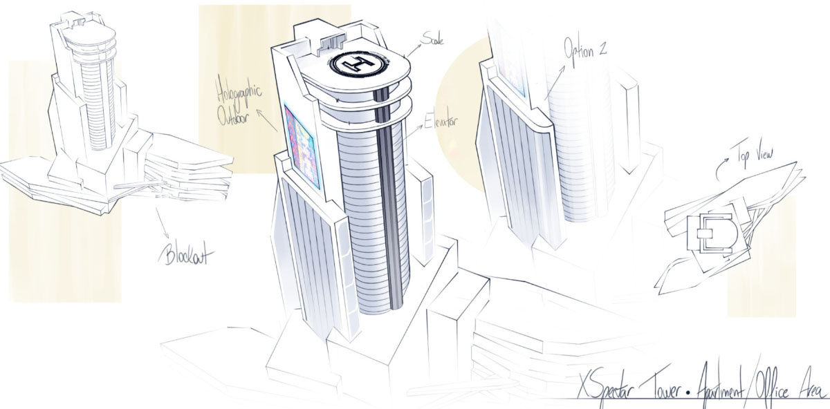
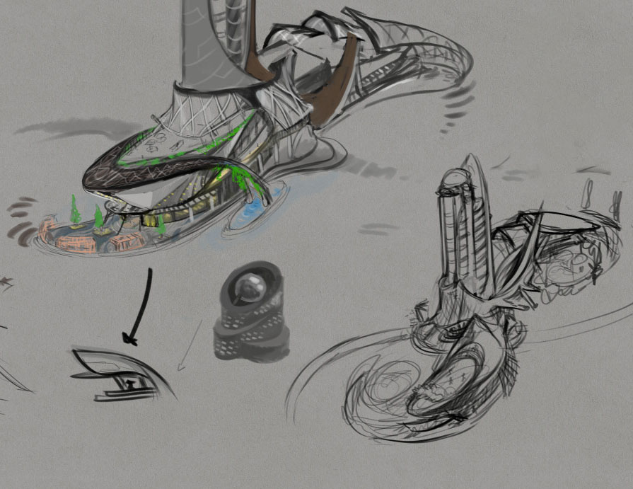
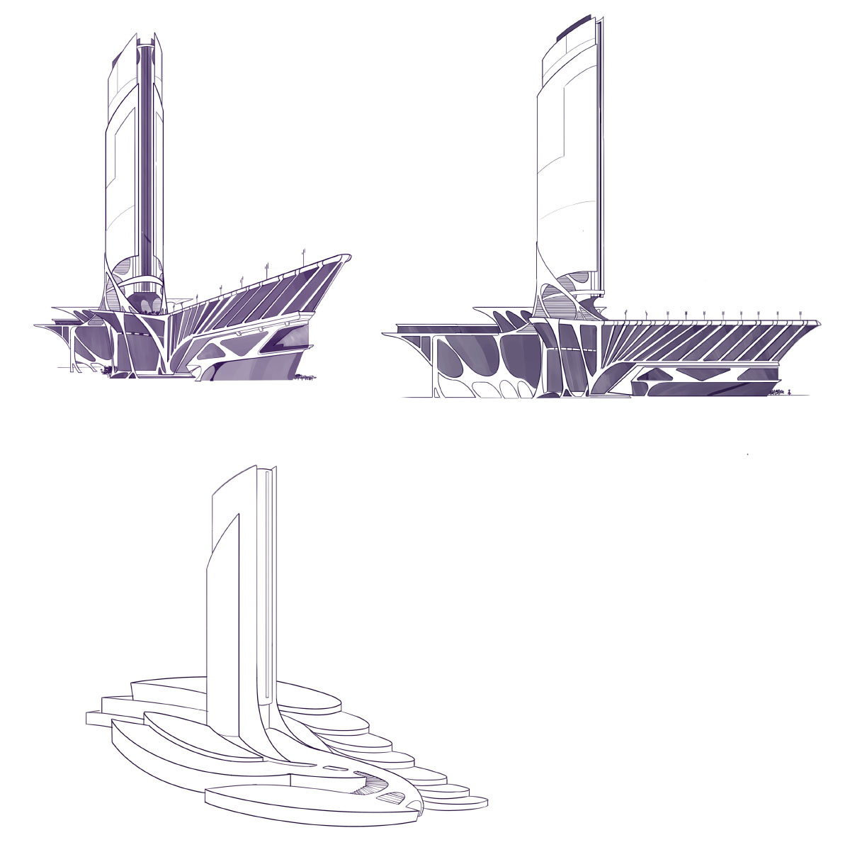
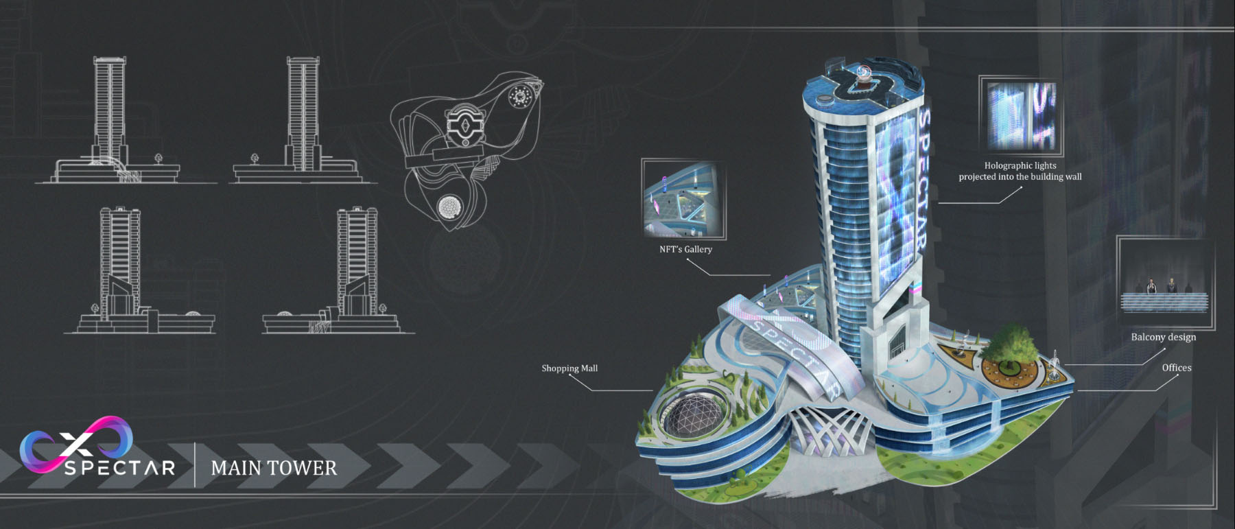
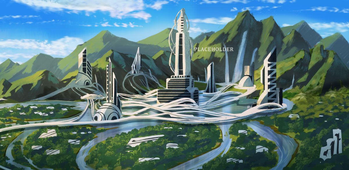
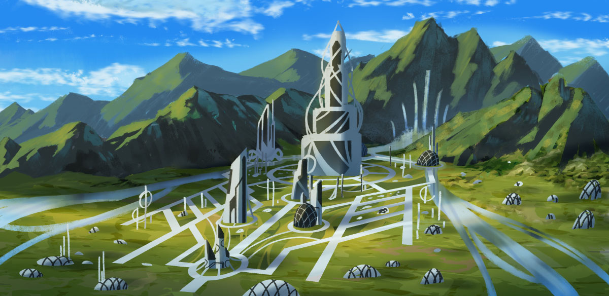
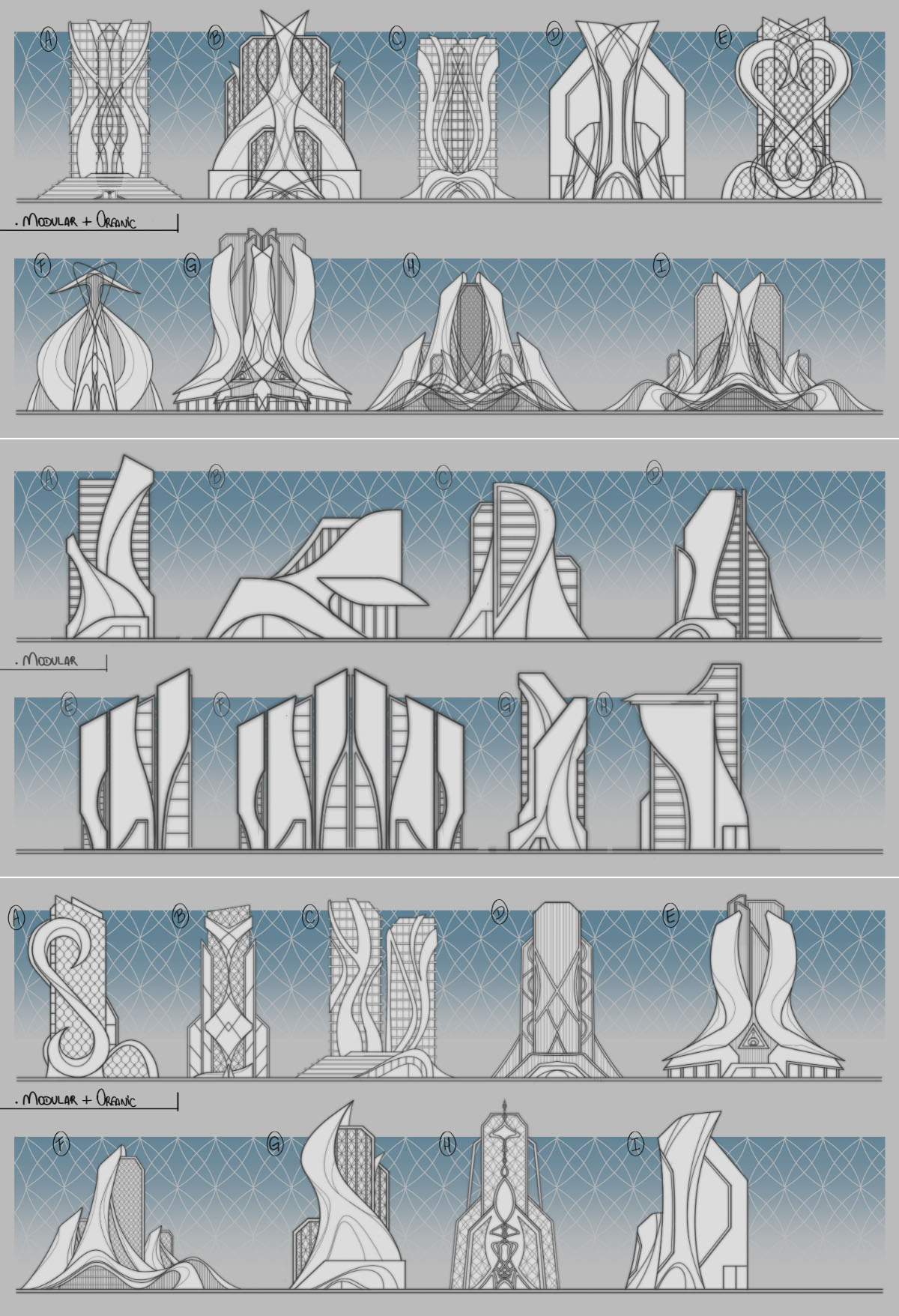
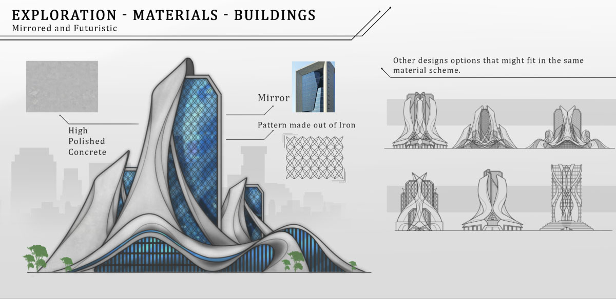
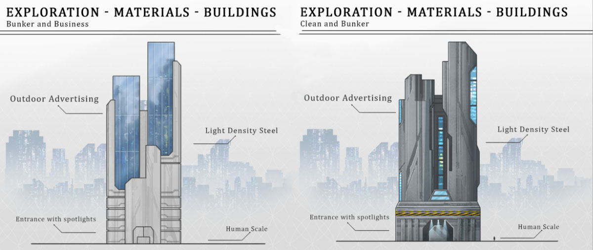
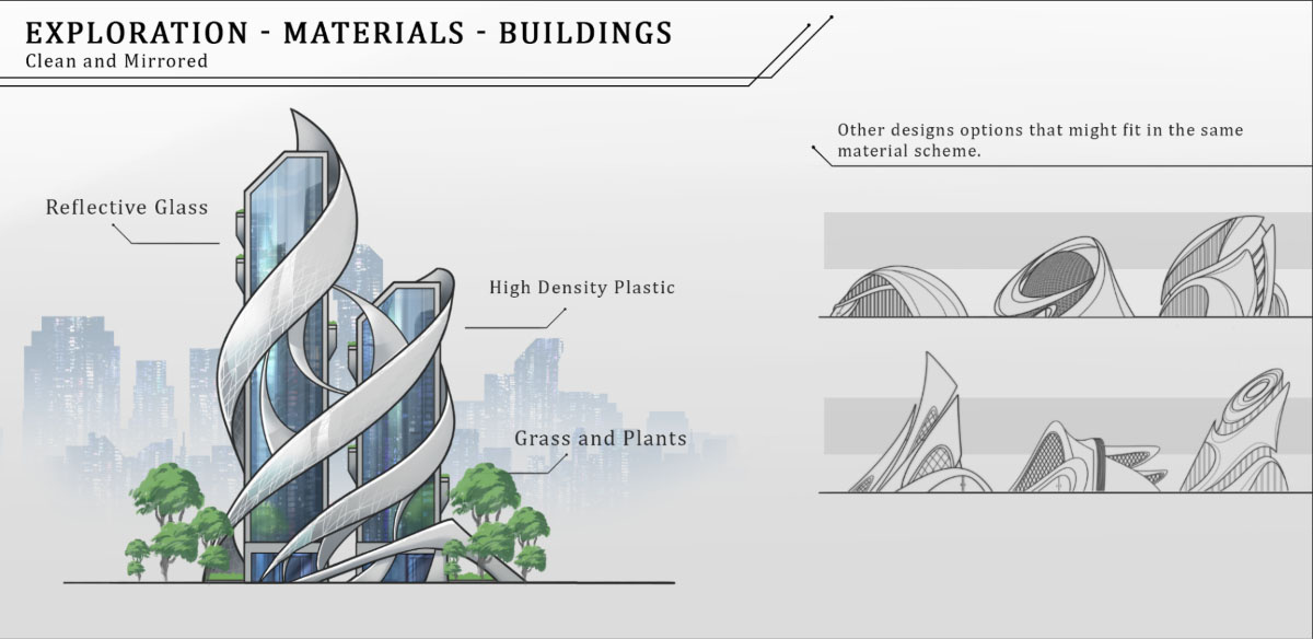
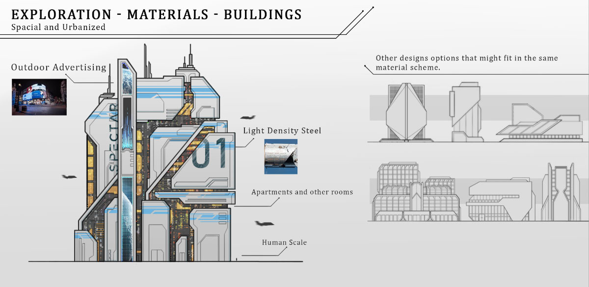
With a satisfactory mood set, we turned our attention to properly develop key elements of the project.One of the inherited elements was the main hub, the xSpectar Tower. As we delved further into the project and definitions, we decided to rework it to make sure its appearance matched its importance.This is how the tower looked originally:
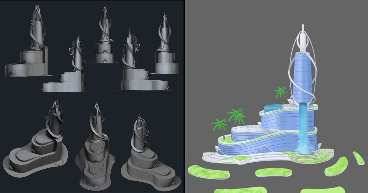
This is an exploration created by our team. It is part of the reason leading us to the decision of reworking the tower since, as this helped us visualize that adjustments would be necessary for it to fit into the new aesthetics.
Below you can check a small part of the process redesigning and creating it's final blueprint, which involved lots of research, moodboards, silhouette studies and more.
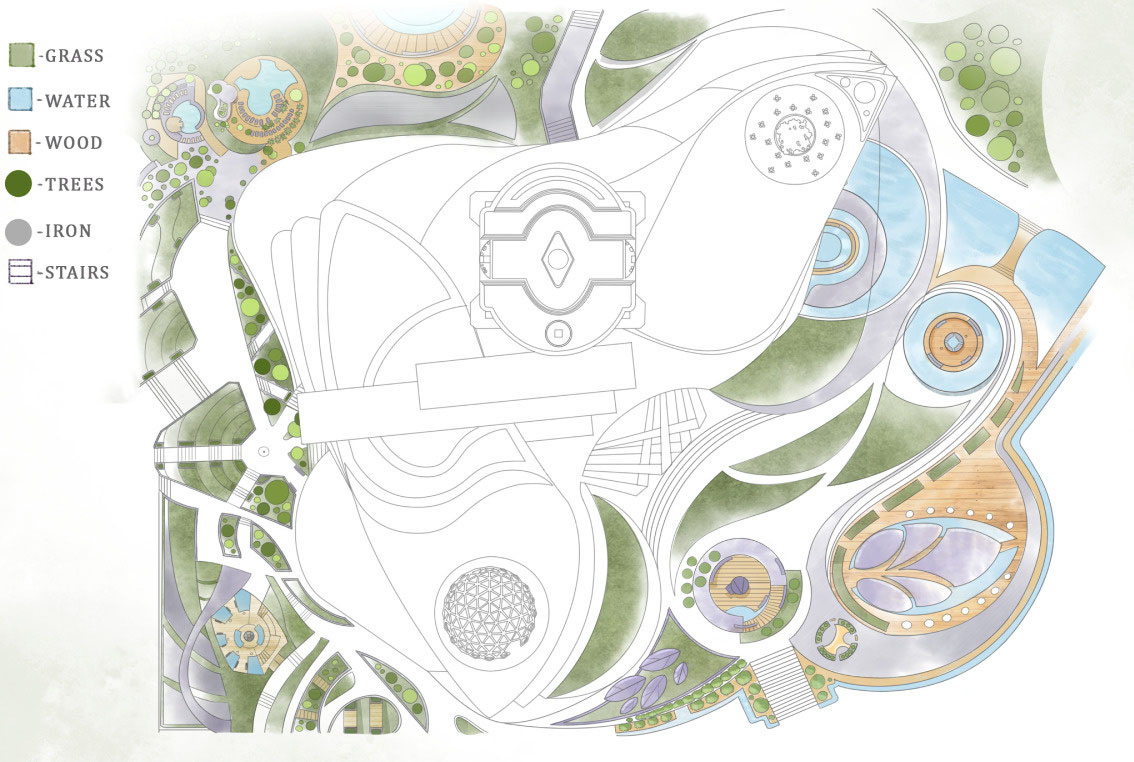
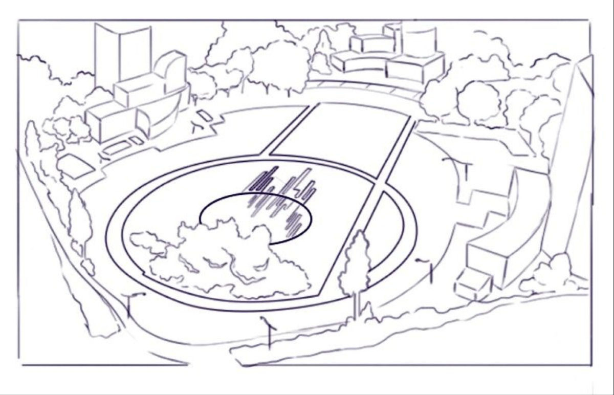
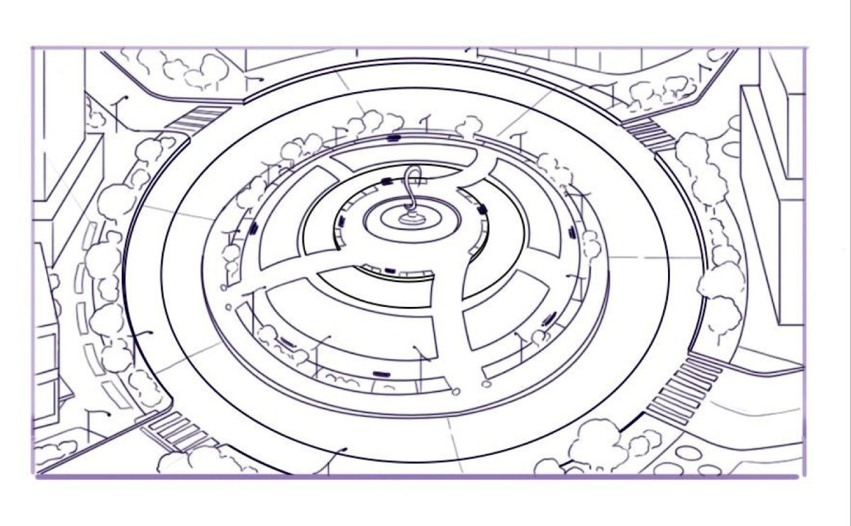
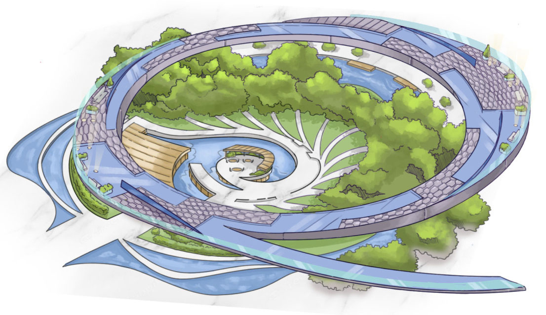
In parallel, the team was working on possible layouts for the downtown (where the tower and first beta would be situated)Here we had a lot of back and forth with the Game Design team, trying different ideas about how to organize, and what impact it could have on the view and player experience. With and without lakes, more or less nature, more or less populated, etc. Following are a few of those explorations:
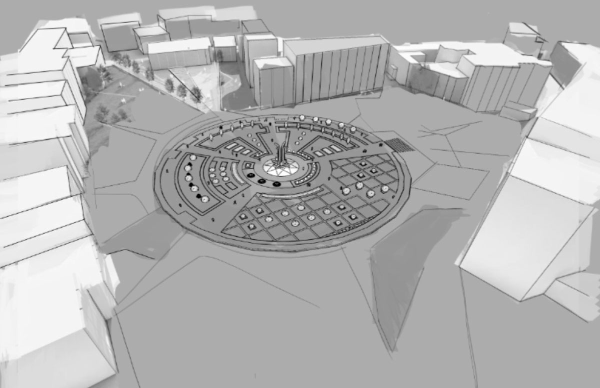
Besides the overall downtown layout, we were particularly close to the GDs during the development of the plaza, the actual area where the beta would happen.
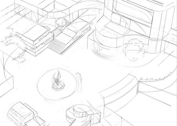
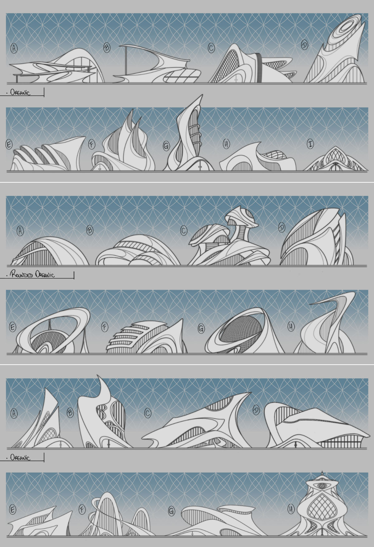
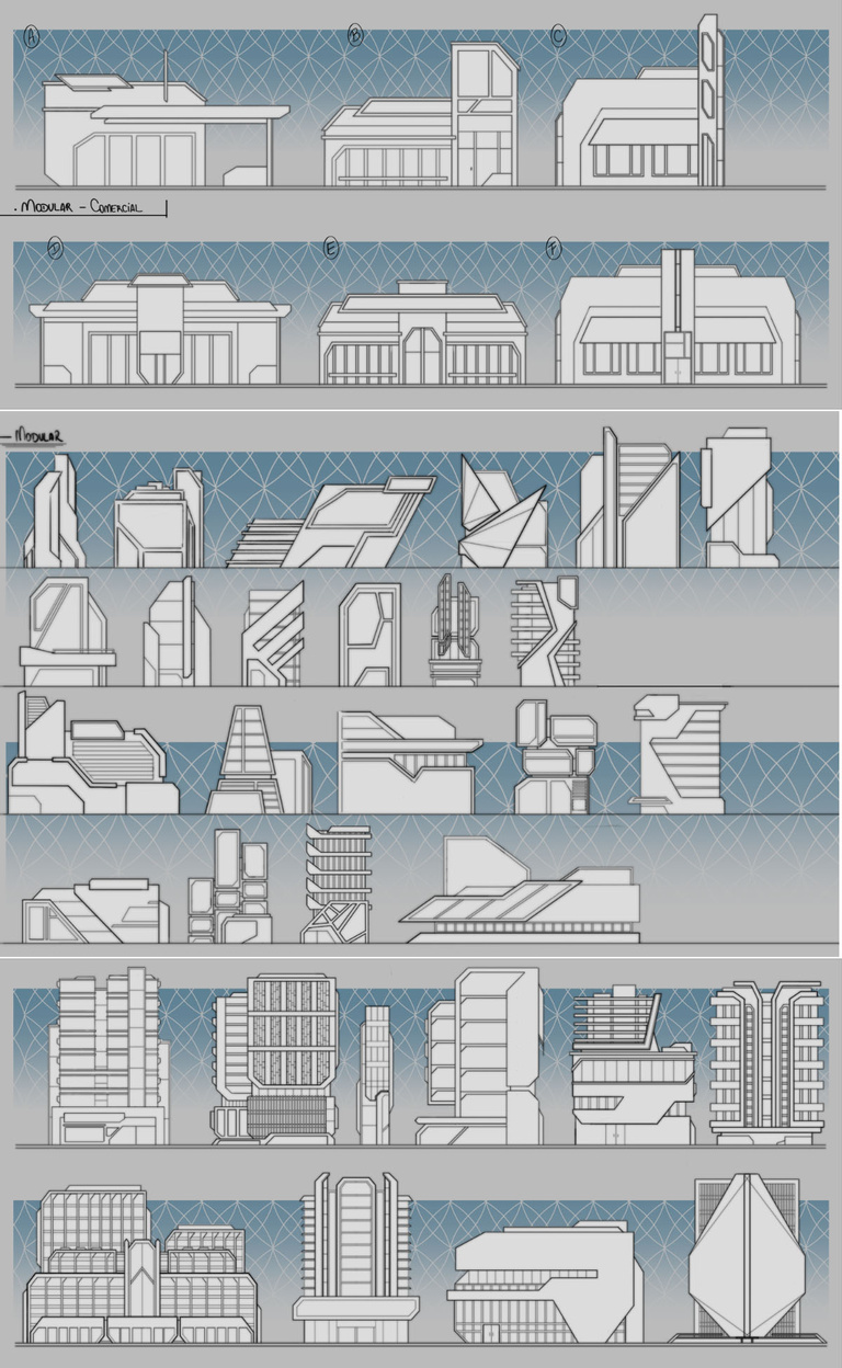
We also explored lots of buildings designs in order to populate the surround areas, creating variations for fancier buildings, regular houses, stores, etc.
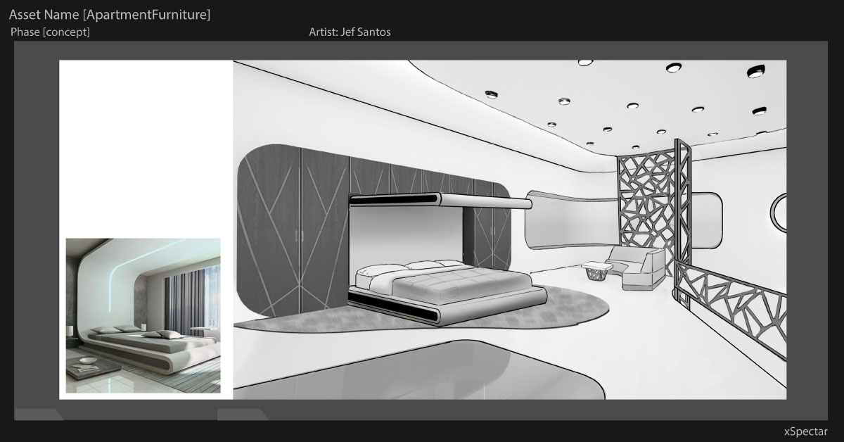
Turning our attention somewhere else, the first apartments were being developed as well, since they would be the first available plots on sale, and first interaction the players would have with the game.Following are some schematics nad floorplans we worked, alongside with GDs and programmers to test its viability.
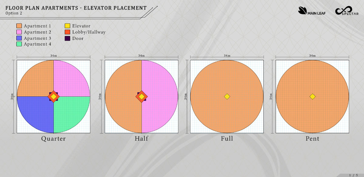
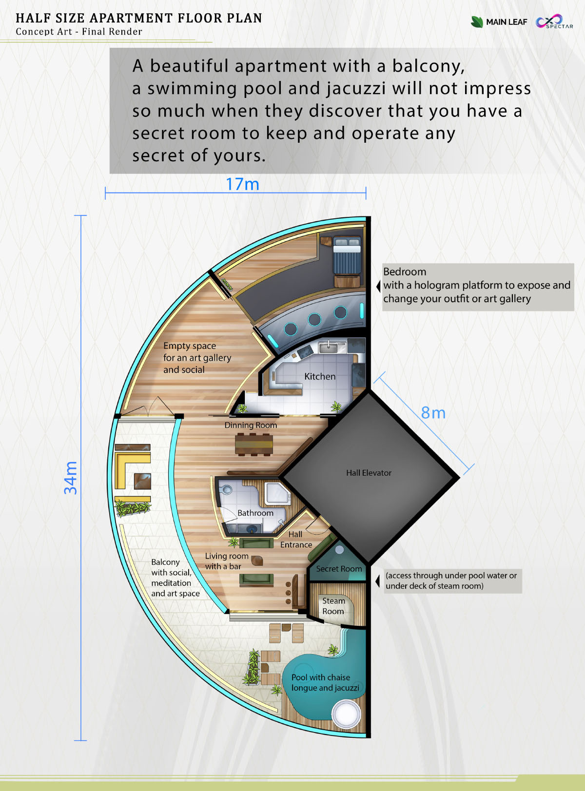
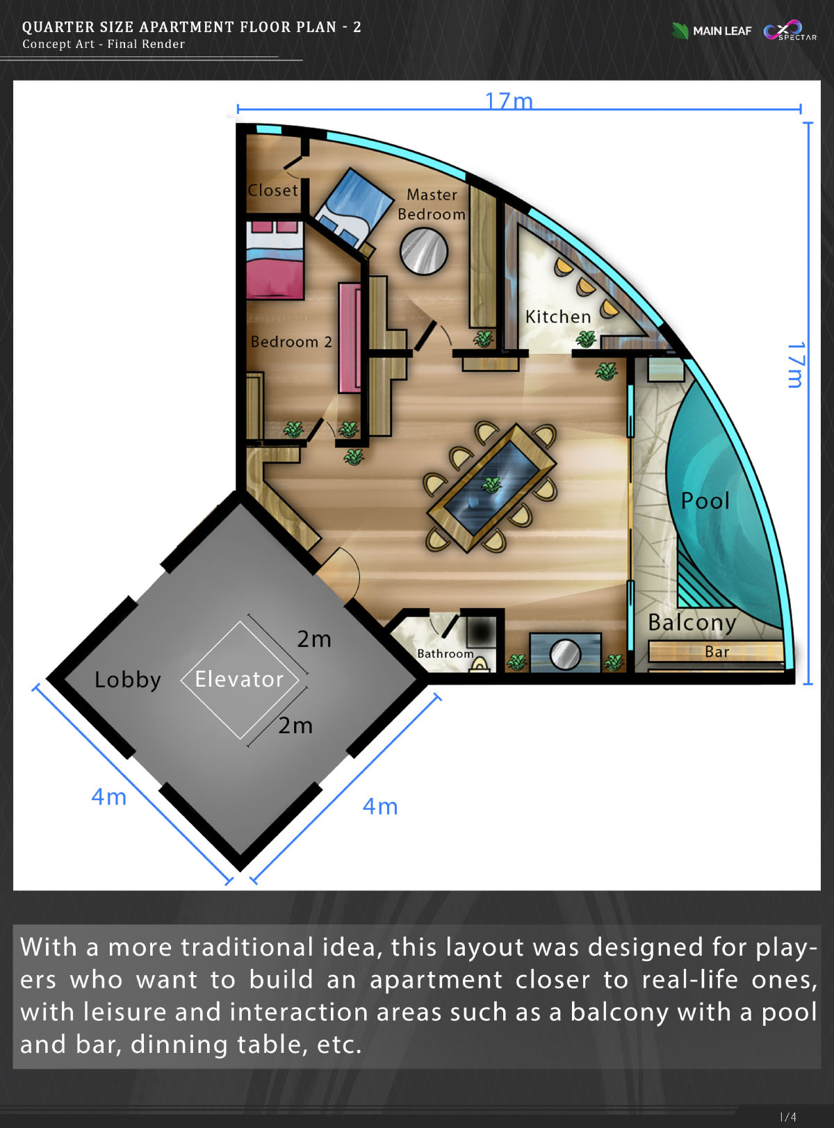
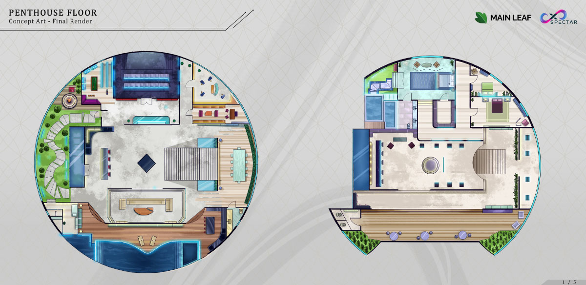
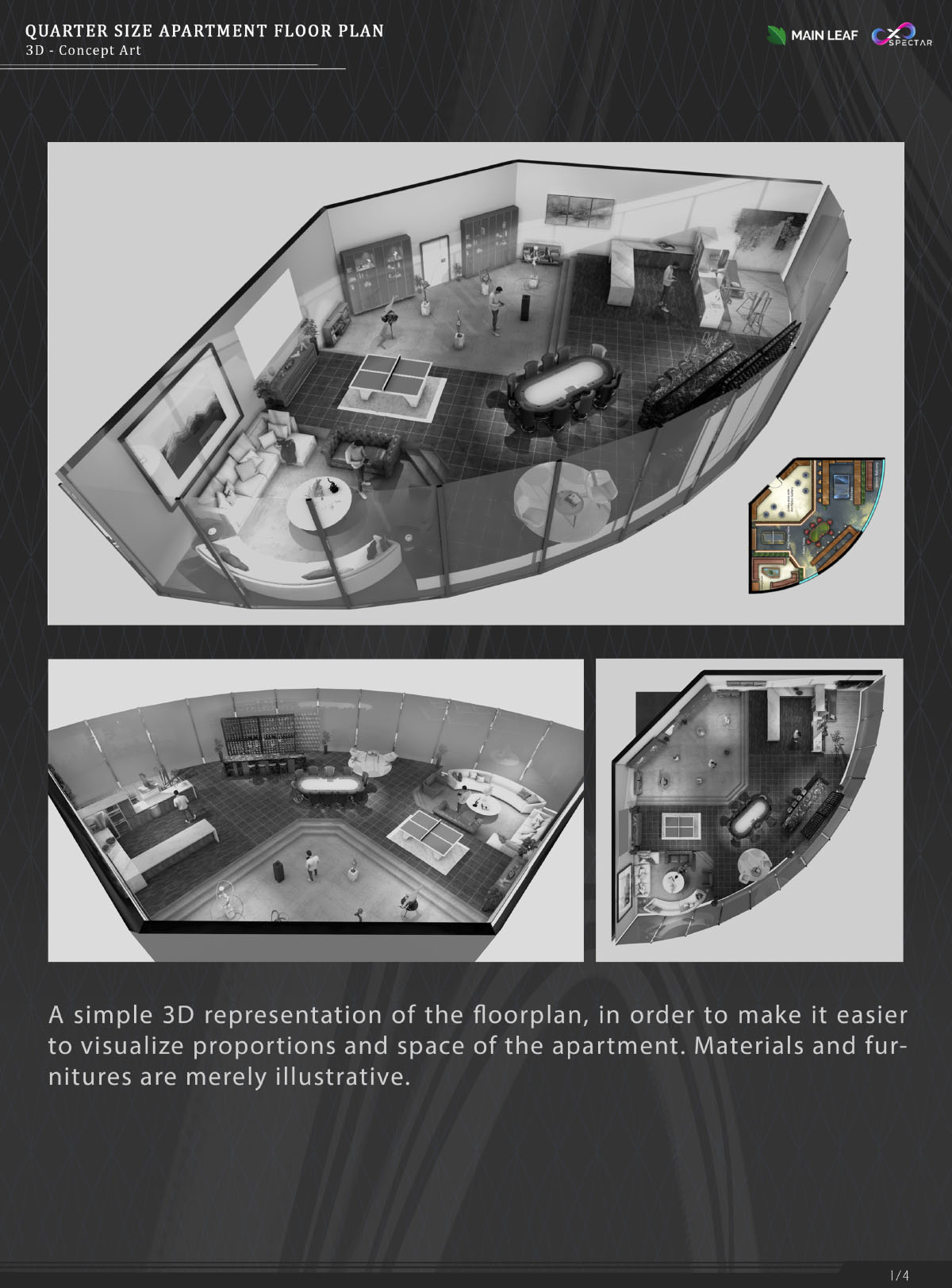
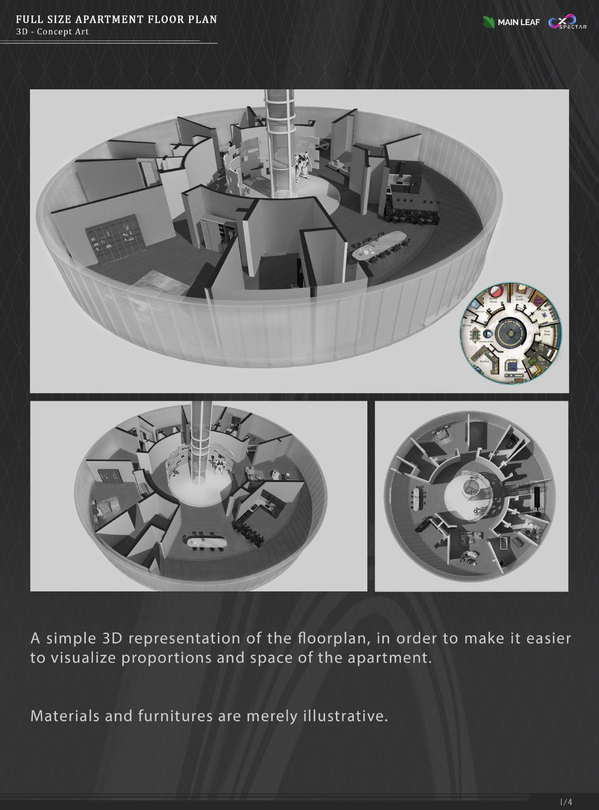
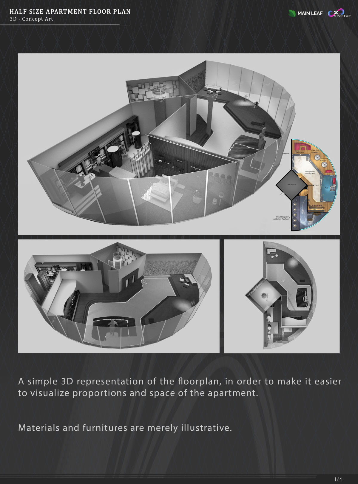
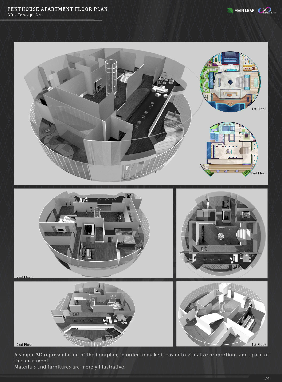
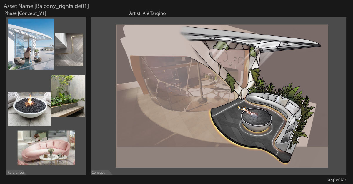
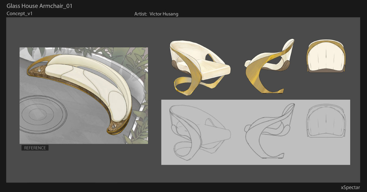
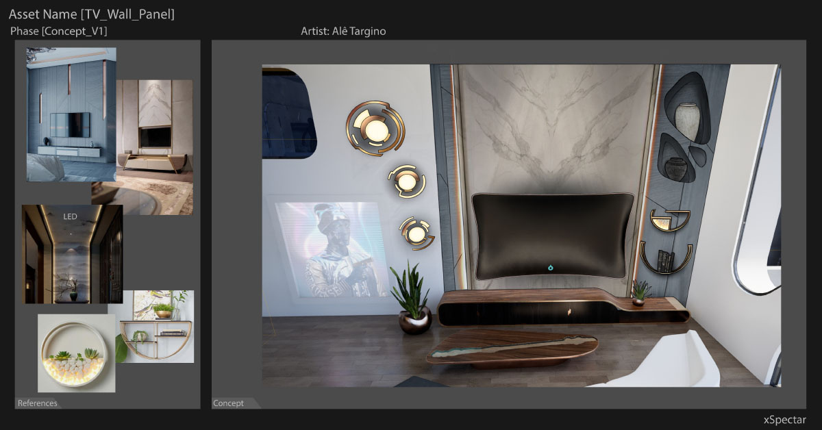
Our team was also dedicating their efforts into creating furnitures and decorations for the interior of those apartments, so the 3d team could start modelling and properly test the first plots.
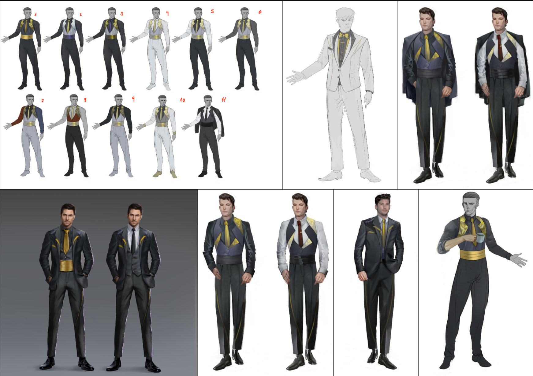
For characters, we wanted to create a roster of base options for the players to choose and base future creations on.
Similar to the buildings, we aimed for a modern-futuristic and elegant aesthetic, reimagining what social garments would look like in this setting.

Ever After — Turn Based Combat (JRPG)
For Desktop and Mobile platforms
Ever After, a story focused experience, tells the tale about a world that has overcome the finitude of life. Centuries ago, the protagonist's ancestor defeated Death, gifting immortality to the world and boasting the prestige that came along with it, turning their lineage into those of kings.
However, as perfect as the world might seem from within the palace walls, what happens to the unfortunate and miserable, having their souls trapped inside an immortal prison of flesh?
The answer is simple: their bodies become twisted to match their spirits, becoming Aberrants.This story happens in a fantasy-like setting, with an anime aesthetics, mixing some technological advancement with a medieval coating, due to the stagnation brought by the immortality's inertia.
This is an ongoing project for which I was asked to review and assist on the creation of a stronger vision and visual development.Following, are a few images from the material they had created:


The client mentioned feeling the project was missing a visual identity, which I concluded to be due to a lack of cohesion between the world's story and the designs.E.g. The farm area shown above looks like a regular green zone. But according to the lore, everything in this world became immortal and is at risk of becoming Aberrants; even plants.
How would this affect the environment?
How could crops be cultivated while avoiding danger? How rare meat and leather would be? What other resources we take for granted would need to be adapted in this world, similar to how on Dune they use their suit to preserve moisture?With this line of thought, let's review the main square, in front of the royal palace.
I'll start by phrasing what I interpreted to be the key points about Kladius according to the lore:“The game starts in Kladius City, in the square in front of the royal palace, house of the hero's descendants that slayed Death. Currently, there is a huge festival happening to commemorate this feat.
We are in the most powerful kingdom, in a tense political situation. This setting, despite being reasonably developed, is still quite outdated due to the stagnation caused by immortality, creating a clash between old and new.”


Breathing life into these points will be the key here, so let's look at how we can address them, shall we?


Militaristic. This is first term that comes to mind, since: the royal family is from a line of warriors, they are the “strongest nation” within a tense political setting, and have a Queen described as pragmatic, prioritizing their nation above all else. I would bet its surroundings would be the safest place to be, but also the most rigorous.Some degree of opulence and prosperity would likely be on display, reflecting their success, but in moderation due to the Queen's pragmatism.The current design has a lot of straight lines, which helps to imply order and strength. However, I still miss a more "grandiose" and "controlled" felling, as the current version can feel claustrophobic and confuse due to how elements overlap.I would open up this square, add soldiers around and limit access points, creating a beautiful but tightly controlled place, similar to the references on the left. This way, Kladius would reflect its role in this world.
Add Symbology.There are wolf symbols around, which is the royal family's motif, but they are far and few in between, easy to miss.This is a great chance to not only reinforce the palace's dominance, but also to reflect this region's culture. Stained glasses, murals, sculpted pillars, ornaments subtly reminding a wolf's silhouette; you name it.
On the right we can see Hades' palace, which is shaped after his helmet. It creates an incredibly unique architecture, while also contextualizing us about its function.God of War context can be exaggerated compared to Ever After, but as far as examples goes, it embodies perfectly this concept.Dragon Age is another incredible inspiration, showing how symbology can stem not only from obvious motifs like statues, but subtler ones such as architectural aesthetics.


Let’s add some opulence. As a classical symbol of power and prosperity, we should think how to reflect this without necessarily resorting to the obvious (e.g. golden statues). A "rich" city could boast it through complex and/or luxurious architecture (be it due to building techniques or types of materials used), and embellishments like gardens, etc. Particularly in this world, where even plants are under the risk of becoming Aberrants, I can’t imagine anything more representative of wealth and prosperity than a well-kept garden.Currently, the “festival” seem to be just a few vendor barracks on the side. Even the play, a staple for the occasion that has been commemorated for centuries, was done on simple stairs with actors barely wearing any costume. This makes it feel like a regular street performance, not a festival.Properly decorating the environment would completely change how we perceive it.
This area is a prime example of what I feel missing in this world's construction. A few key concepts developed based on lore implications can immensely clarify and enrich the project.The same logic can be applied to other elements, which I'll apply on the Aberrant enemy next.
They resemble a standard ogre-like creature, leading us to associate this story with yet another fantasy setting instead. Some of the main characters also have a very traditional fantasy-adventurer appearance, reinforcing this feeling.The core of the issue lies in the creature feeling too plausible. It looks like a creature that could exist in this ecosystem, instead of the deformity the Aberrants are described to be.The extra arms are a good touch, but not enough by themselves. Even more so when we look at the belt. How can a transformed creature that lost their reason wear a perfectly-sized accessory?

Reference images from diverse sources

According to the lore, Aberrants have an unfortunate connection to religion entities, since only the churches are able to seal the creatures. Being so, “Angel” would be a perfect theme to follow, but regardless of whichever direction is followed (angelic, demonic, insect-like, animal-like, etc), I believe this could be one of the biggest cornerstones in painting this world into existence.E.g: let’s assume Aberrants have a skin like ➀ and weapon-like protrusions similar to ➁.
Due to resources scarcity, their hardened materials could be a prime source for armor and weapons. There could be beliefs surrounding their skin, that it slows the corruption of the soul when worn.Considering this particular proposal, (3) Is a quick concept I made of how an adventurer using Aberrants as the prime source of material for their gear could look like.This is just one example, but its use can be extremely powerful and expanded into the creation of entire cultures and nations.

When discussing a new direction for them, I would propose a few core concepts, such as:
• Anomaly - Make them feel “wrong” and “unnatural”.
• Uncanny - not only weirdness, but discomfort that translates into fear.
• Unique - Something particular to them, such as a specific kind of glow or noise, characterizing their presence.
• Inhuman - Something too hard to emphasize with, project oneself into or even understand it. Only fear of the unknown remains.

1 and 2 are references, while 3 is my creation

Next, let's look at the white-haired empty vessels created by the church, with the mission to peregrinate absorbing and sealing Aberrants' souls along the way: The Dolls.
The Doll and the woman seem really dissonant side by side, like they're from completely different games. It's the opposite, however, as they’re both from the church.Unequal technological advancements and different garments depending on culture and sects can coexist, yes. But it needs more work, as if that was the intention, it currently just seems misplaced.Due to their intimate relation with Aberrants, I would only tackle the Dolls (and the holy city), when the definition for the Aberrants are set in stone (or vice-versa).Their designs could also reflect the church’s influence (e.g: if the church has specific tunics, most likely there would be a version for dolls as their creations).Personally, I imagine Aberrants and Dolls being kindred in a sense. After all, the dolls' purpose is to seal Aberrants, and what better to hold an Aberrant soul than their own flesh? So it would make sense for the Dolls to be made out of materials collected from Aberrants; hence why I would like to work on them in parallel.


If Dolls were created from Aberrant's purified material, they could share similarities, like patterns, but reversing colors.Another idea, If Aberrants were angel-like creatures, let's turn what looks like to be a tech-wear straight-jacket into folded wings, reflecting the tight control the church tries to keep on the Dolls.This could be reflected in the Holy City's architecture, creating angelical motifs. If they had gigantic towers reaching for the sky to represent their holiness, imagine if they were adorned with wing-like ornaments surrounding them, becoming extremely thematic and potentially awe striking, showing again how helpful assimilating the lore into the visual development can be.
Let's try a rework of the main character, Zander.

Despite Zander looking well put, his appearance is akin to a regular wanderer, with barely any signs of his royal lineage. It is a nice day-to-day clothing, but since he will be on the spotlight for the festival, it's hard not to imagine him using something more regal.The hair fits him well, but could use some more work since the flow of the bangs and its spikes are not too harmonious. His main color is blue, being the hue of his eyes and hair, which is nice to keep in mind, so let’s work a bit more the value contrasts to avoid elements merging (such as the hair with the coat).

Reference images from various sources

Similar to how I analyzed the square, let’s write down the key concepts I see for Zander.“Zander is a young looking descendant from the hero, being a trained warrior himself, resulting in overconfidence and cockiness. Despite being the prince, we can see how informal he wishes he could be based on his dialogues. His family’s motif is a wolf, which is used as symbol around the palace. By looking at his current design, we can see Zander takes notable care of his appearance, letting his personality and style shine through”.

I started by imagining what royalty could look like. To represent the political tensions of the world, "militaristic" is again the word that comes back to mind.
In this particular setting, still being a
fantasy-like adventure, I can see armor pieces (or cloth styled in a way alluding to armor) working particularly well along their attire, even if only for the symbolism of the “hero”.The world being a mix of stagnated and advanced, I envision the clothes being old-fashioned, but with small key details making them feel slightly modern, representing how the old generation is still around (and likely holding to their ‘old ways’), with small steps towards modernization.In order to boast their wealth, I imagine organic materials are quite expensive. Leather fits the bill since it can both be adorned and sculpted, creating incredibly detailed pieces easily integrated to clothing.Considering that everyone is immortal, a leather armor that is more vanity than function fits perfectly.
It's hard to imagine Zander without a long cloth hanging around, like his coat, and a flamboyant hair. So regardless of how regal his clothing should be, I'll keep this in mind since it can’t overshadow his personality. He surely would find ways to style the attire, even at the cost of formality.

Reference images from various sources

Reference images from various sources


Reference images from various sources

I'll use his current appearance as a
north since the intention is to iterate on him, not completely overhaul. So let's pay extra attention to his relatively unraveled/rebellious haircut, and sharp facial features.
I believe for the hair we can try making it a bit more “flowy” while keeping its spiky nature, like a mix between the references on the left.
Notice how the hair strands does not follow a smooth flow, but instead a “broken” one (red lines). This is what we are trying to remedy.
Its also worth mentioning the overall shape feels kinda weird due to the trapezoid silhouette it forms (yellow lines).


His sword is really close to what I envision. It perfectly fits what could be an heirloom, as it is nicely detailed, but not too much to the point of looking like a decorative piece instead of a “Hero’s weapon”.
It would be interesting to see more wear due to the passage of time, with blunt or broken bits, even more so since against Aberrants submission-based weapons are recommended instead of lethal ones.
Setting visual targets to pursue:

Reference images from various sources

Reference images from various sources

Reference images from various sources

Reference images from various sources


This is the concept created from these directives.
I tried keeping his physical appearance mostly the same, focusing on his attire.I aimed for a military aesthetic, with the red cape being a strong symbol associated with rulers. This symbolism is focused on his torso, balanced out by the rest of his garments that lacks such signifiers.Details like the unruly belts and folded sleeve adds to his
joviality and irreverence, and the blue colors + the leathery wolf
shoulder pad screams his family’s motif.The leather-armor gives enough of a fight-ready energy, as a warrior like him should have, with easy to move clothes assisting this purpose.The sword was kept mostly the same, except for the tip that has
been worn off.My target was the middle way of “modernity”, so if he
jumps back into his original overcoat, both clothes could coexist and make sense for him to use.
Technical considerations.
As a work in progress, I understand that most of what I'm about to point out might just be still in development.However, I thought better pointing out enhancement opportunities just in case.Starting with the 3D models' appearance.
The target audience for games with anime aesthetics tends to be very particular about looks, so it's of utmost importance getting it right.However, I often feel an "uncanniness" coming from Ever After's characters.

When comparing side-by-side to other games with anime aesthetics, this becomes even more apparent.

Below is a few edits to show how a bit of difference goes a long way:


Speaking of models, a target level of detail/resolution for the textures should be set. As far as I can tell, this project is aiming at a clean-ish cell-shaded style. However, we can find textures varying widely in texel density.An example is these wooden box, which has finer details than most of the map put together.In the bottom image, notice how out of place the boxes look like within an otherwise clean and simple texturized environment.


SS from the game

SS from Genshin Impact


The shaders/post-processing effects needs to be reviewed as well.In the square I miss a sensation of depth, creating a very confusing environment due to how many buildings overlap each other.Genshin Impact below it, however, is as busy as the square, if not more, but still readable.Fog, depth of field, ambient occlusion, as well as reworking lights and shadows are all tools that would immensely improve this aspect.
There's quite a few shadow-related artifacts happenning across the game. To point a few:• Some characters seem to receive strong shadows (marked in blue) while others seems to be barely shaded if at all (marked in red).• In the farm area, we can see how the shadows interact differently depending on the objects. Some having extremely dark shadows, while others barely feel shaded, making them not seem to fit together.• Also in the farm, it's really clear how weirdly the light is interacting with Zander. Notice how despite casting a shadow, as he steps in and out of the sun we see no difference on how he's being illuminated.


SS from DS2

SS from DS3


And something that might be worth revisiting is adding a few details here and there.Currently, despite all the overlaps, most areas still feels weirdly empty. Details in the environment goes a long way in creating a breathing world.A very good example is those screenshots from Dark Souls 2 and 3, respectively. Both are simple rooms, yet DS3 looks so much more alive. And while yes, a lot of it is due to each game's shading engine, just as much this emptiness comes from the lack of dressing the rooms.
Look at the difference a bit of tuning in the lighting and extra dressing does to this scene:


As a closing thought, experimenting with shaders and post processing is extremely important. By themselves, they can elevate a simple game into looking amazing. Minecraft's mods perfectly exemplifies this, as the scenes and textures are literally the same, the only change is turning on the shader:

SS from Minecraft

The shader above focus on volumetric light and post-processing, and while it does look amazing, it is but one option to make a game look good.
Intentionality is a strong weapon, making even the simplest of games look amazing.Zelda Breath of the Wild perfectly encapsulates this idea, showing how a volumetric shading would actually be detrimental to its aesthetics.

SS from Zelda BotW

A few titles I believe we could search inspiration into, including Zelda shown above, are:• DNF Duel
• Metaphor: ReFantazio
• Marvel Rivals (which has a really interesting cartoony style, which would perfectly translate into an anime aesthetic)And, both a reference for the Aberrants designs and a perfect example of artistic intentionality on the use of shaders:
• Clash - Artifacts of Chaos

SS from DNF Duel

SS from Metaphor: ReFantazio

SS from Marvel Rivals

SS from Clash - Artifacts of Chaos


G e n e r a l i s t ͏͏A r t i s t (BKP PAGE)

Illustration


Animation & Pixel Art


Concept


Company Works


Character Art


Stylized


✫ Illustration ✫

Heroes Feast 🗍

Rissé's Respite 🗍
✫ Illustration ✫
Heroes Feast
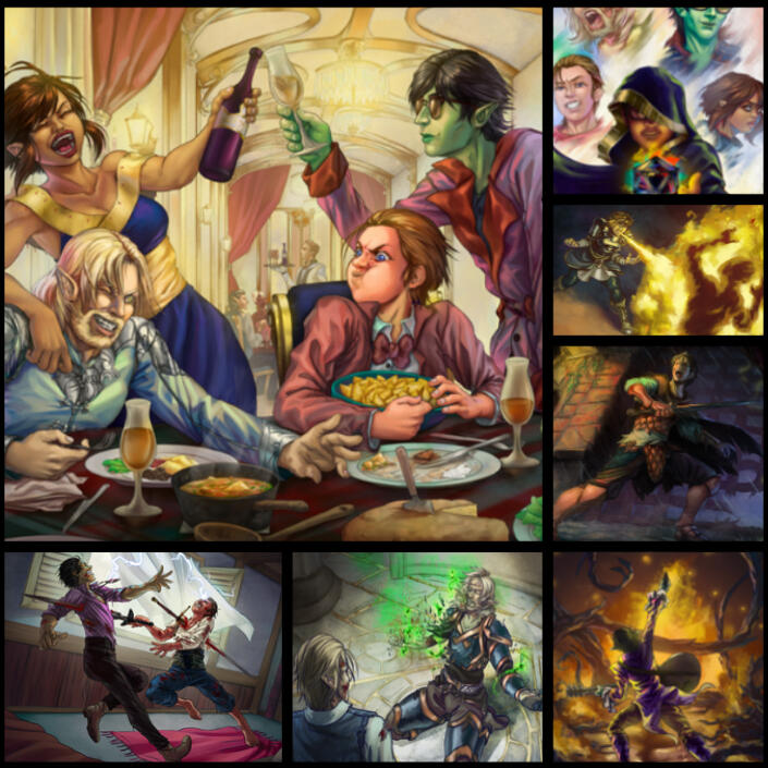
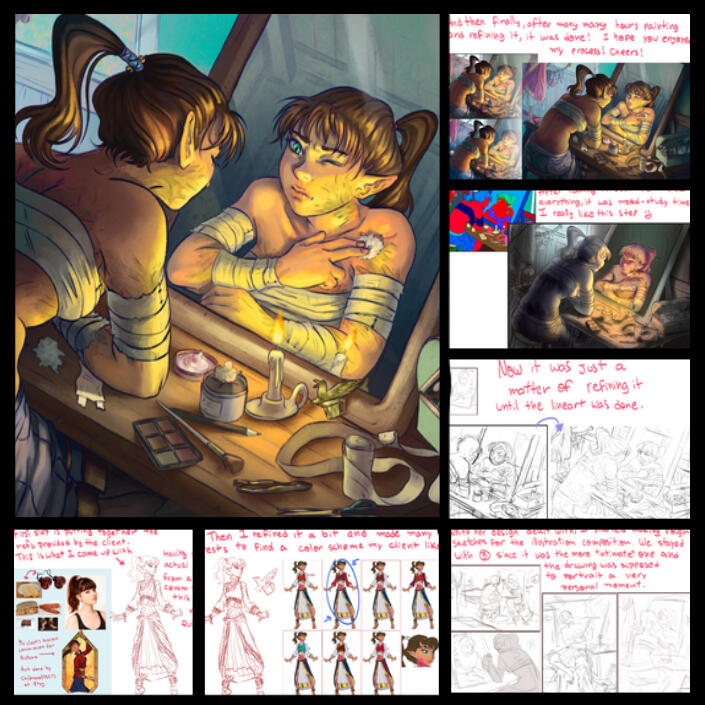
In this project I was asked to make several illustrations of an entire DnD party, portraying memorable moments of their adventures so far.One simple illustration and head-shot portrait per character + a refined group shot illustration. Being able to flesh the same characters in different scenes, and the fact that this one player of their group asked me to make such cool gift for his group, made this commission to be particularly pleasant to work with!
"After gauntlets of challenges, the party managed to come on top, even defeating an elder brain! For sure their tales won't be forgotten any time soon, nor will be the huge feast given in their honor for it hosted too many embarrassing memories, drunkard declarations and the finest food around to enjoy the show!"

The main course of the meal, the group shot! Even though it had the most straight forward briefing, it was by far the hardest execution. The group should be together feasting, in what might look like a family's party photo. The catch though was how big and detailed this picture needed to be, with each character being as big (if not bigger) than what I usually did for full-body character drawings. Challenging, but very fun to make them interacting like this bringing forth a bit of their personalities.
"They always had their issues, and one too many drinks later the animosity turned into a much more heated discussion than anyone could have ever expected, much less a father disintegrating his own son. Devian was killed just like that with his father looking down on him, but he kept true to the end as a cleric. He went not in what seemed defeat, but a final embrace of his god's light. "

Albeit the tragedy of the scene, this one should feel calm and regal. We tried other camera angles, but they ended up looking like he either was 'ascending' or being sacrificed. The way it is we managed to show there was a fight, that he was defeated, and yet accepting his fate and basking one final time in the light.
"We don't care who you are or how many of your goons corners us. To our friend, you gave anguish. To us, a loss that will be mourned 'till our last breath. To you though? I'll deliver tenfold and then some the suffering you caused ! "

They were not about to leave like that what happened to their friend, and so any mourning tears on Moira's face evaporated into scorching fury. Another very straight forward briefing asking to represent all the fury in her face, tense muscles and posture! Probably the simplest of the batch but also the most fun since I really like painting fire hehe
"His companions were either frozen or about to kick the bucket, so it was up to Ollie saving the group from what would have been a catastrophic encounter with an elder brain. A do or die moment, with a desperate determination and a guitar in his hands, he managed to blast away a miraculous fireball finishing the job his party so earnestly fought together to achieve, saving everyone by an inch."

Ollie is a fame-seeking bard, one very eccentric at that! As tense as the moment was, we wanted something glorious and flamboyant, so it was an easy decision going for a movie poster(ish) composition, with his back turned to us, posing and playing his guitar like nothing else matters in the world. It's his moment on the spotlight. This illustration precedes chronologically the dinner picture and it's the reason such commemoration was thrown in their honor on the first place!
"Back agains the wall, Arnen could barely stand. Alton surely was no foe to be faced alone, but what options did he have besides that? Certainly not death, for only a fool would choose that."

Separated from his group, alone against a boss NPC, Arnen was NOT supposed to come out alive... and yet, lucky blessed him. The client wanted his struggle represented in all its intensity. It was night, raining, barely lit by a single torch. In the light you see him trying to put up a fight, but going towards the shadows you can see the truth: his armor is coming undone, his clothes tattered, his left hand unusable. The cherry on the top was framing him using the enemy's hip and arm; we can only feel his menace, and Arnen is dwarfed in comparison.
"As a destiny's mockery, there he was again, in the same inn as him. Arnen could not believe, but a fight was inevitable... Although since both were without their armors, Arnen may stand a chance...? Either way he would try his best to turn this misfortune into a stroke of luck."

A second illustration for Arnen, he again faces the boss from the previous picture. Both of then fell by the end of it, but with incredible dice luck only Arnen survived. I thought about playing with their positions reversing the previous illustration and put Arnen on the left instead, but I felt it made him more imposing than it should. All the cards were against him, he was much weaker than the enemy in a volatile situation; feeling which we wanted to represent. Even if ever so slightly, I tried making the boss on the left a bit more imposing, his posture doesn't being as broken as Arnen's and he also had his lightning attack, but compared to the last time, this time he is visible in the frame within sword's reach. Arnen on the other hand has his clothes even more torn than the boss', the sword piercing his chest with more impact and blood gushing, his hands going limp; if someone were to bet on the winner after witnessing such fight, they'd bet on the boss to get up and survive. And yet, the lucky underdog won.
Arnen got 2 illustrations for him, but hey, Arnen's player was the one who commissioned all this! He deserves it!

Every character got their own illustration, so they could not leave their DM without a gift as well! I was asked to make head-shot portraits of them to use for icons and such, and the idea hit me to turn this into a poster with a representation of their DM. For sure, the last cherry on top!
Bellow you can check some of the skeches and process for these pieces! Sadly I lost a lot of the thumbs I made for them, but with everything together it should give a good idea of my process.


✫ Illustration ✫
Rissé's Respite
A particular intimate moment to illustrate. Astana is a bard-dancer known for her enthusiasm and contagious smile, wearing the most intricate of face and body paintings. Behind closed doors though, she still dealt with the scars reminiscent of the fire that took so much from her.The client wanted a redesign and illustration for this character. At first we tried some gleeful and lively poses, but since he already had a happy drawing of Astana we decided it would be a nice contrast working on this very introspective moment of Astana taking care of her scars; away from the spotlights in silence.

_"A dancer, a bard, and a sisterly caretaker for the children.
Astana was one of the many children raised by the tender embrace of Mama Rissé at the orphanage. It's said to be impossible visiting any town around their orphanage without bumping into one of the children cared by Mama, all proudly adopted the 'Rissé' surname as they grew!
Sadly, tragedy struck. As a fire happened at the orphanage, Astana ran and struggled the best she could managing to save many of the children... but one can only do so much. Mama gave her life pushing Astana away, because even as her body scorched and burned, Astana had no intention of leaving their mother behind and would die trying._Astana took a long time before accepting what happened. A dancer, a bard and a mourner, her smile and energetic self slipped from her. We all learn how to get up, and eventually so did she; wearing a smile, doing intricate designs and paintings to cover her scars, she decided to keep on dancing to raise the funds to rebuild the orphanage, as well as traveling to let her siblings around the country know what happened and pay their respects to Mama."


Later on, I was asked to work again on this character. This time a clothing redesign and a head-shot.Her new clothes should be fitting for cold places and current developments.
She was now a cleric, so I was asked to both represent this in its appearance, create the symbol for her god based on an eye shape and roses, but yet feel somewhat mobile and flowing; she was still a bard after all. And lastly but not least, her dragon-slaying rapier needed to be designed.
I also got the chance to work on her face painting and new hairstyle in the head-shot!


✫ Illustration ✫


✫ Character & Portrait Art ✫


• Loose drawings, comics, 3D, etc •


✫ 3D art ✫
p r o j e c t s

Ta'El Bust 🗍

Smol Ta'El 🗍
g a l l e r y


✫ Concept Art ✫


✫ Animation & Pixel art ✫
Animations


Pixel Animations


Pixel Images & Avatar Sets


Compositions
✫ 3D art ✫
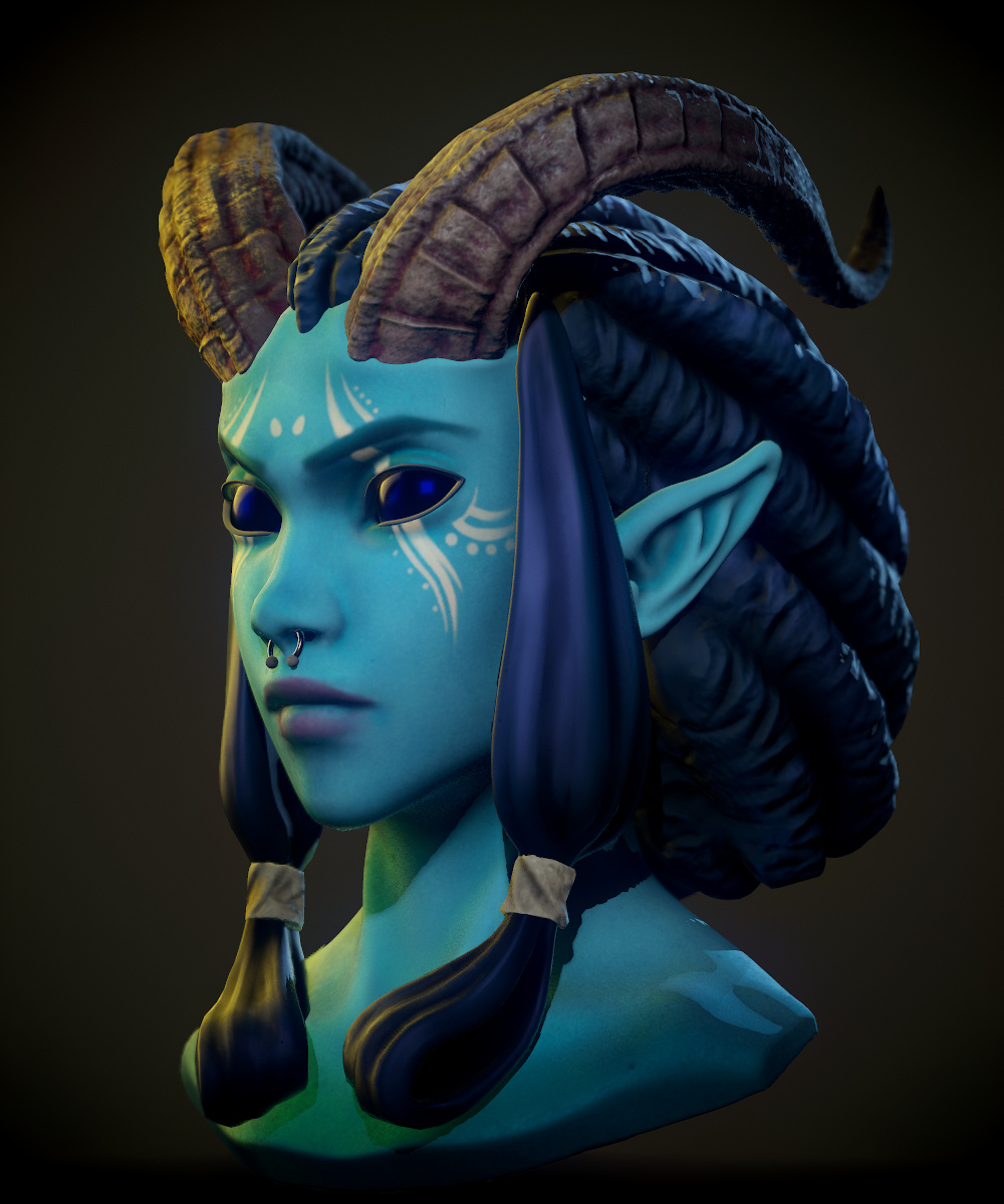
Ta'El Bust
Sculpt for a friend of her DnD character, Ta'El.
I always liked working with busts and such, and really love how this turned out.


✫ 3D art ✫
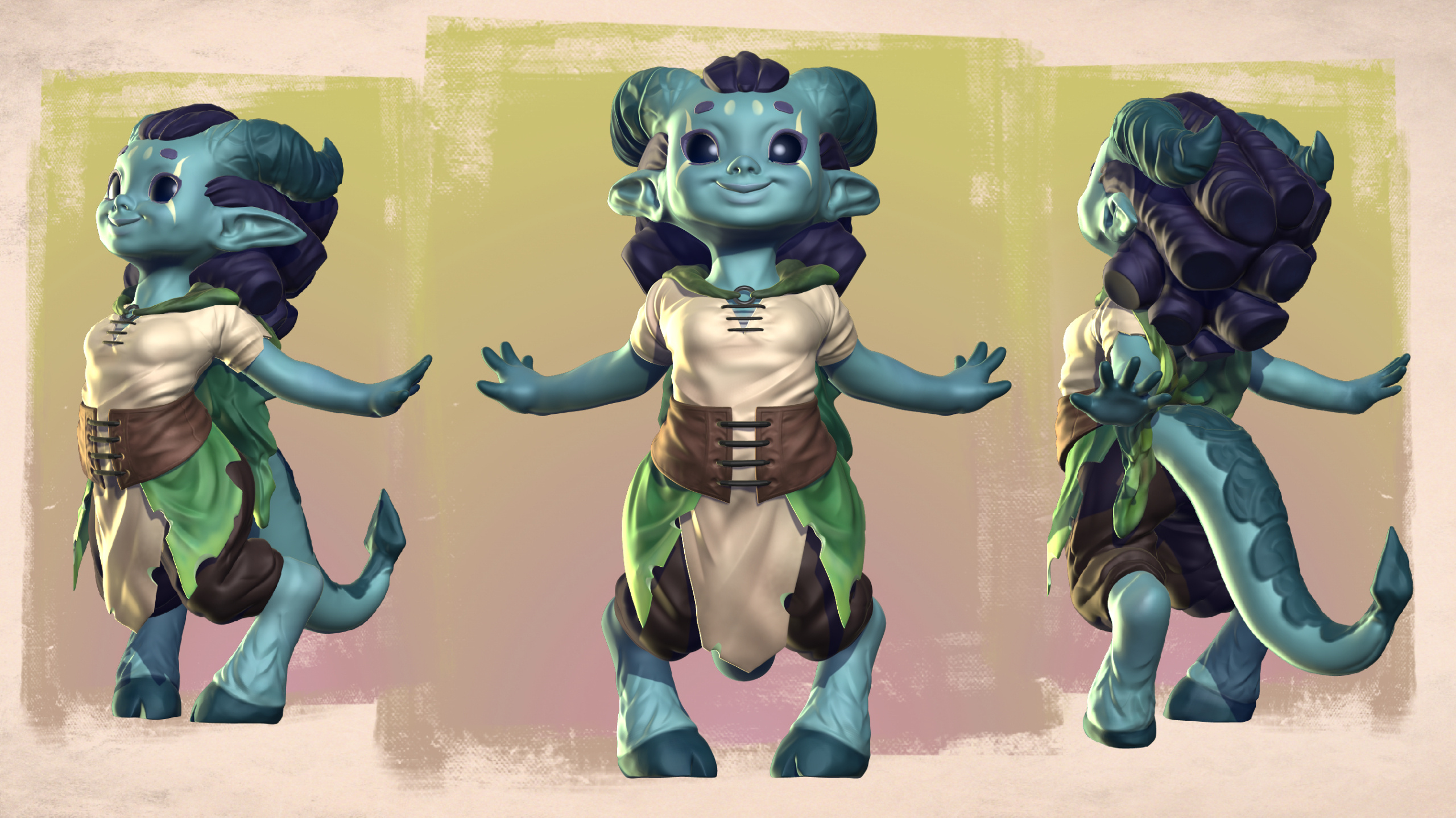
Smol Ta'El!
After creating her bust in a more refined style, we wanted to see this cute design by Bruna Richter reinterpreted as miniature to use on our DnD games!
Can't wait to see it properly 3d printed!


✫ About ✫

Hello! My name is Leonardo Boia (aka @BoiaKK).
I'm a Brazilian digital artist who loves learning new techniques!I have worked as a freelancer for over a decade, as well as a couple of years in the game industry as a 2d artist and Art Director.In the game industry, I have contributed with character and prop designs, character art and illustrations, pixel art and animation.I also worked with these techniques as a freelancer, but with a bigger focus on characters, as well as a few gigs with 3D.I love experimenting with different types of mediums and styles, since
I believe different subjects and techniques complement each other. This allowed me to act as Art Director for games, bridging areas and using this knowledge into bringing projects to life, reinforcing my experience with the production pipeline for games.I always welcome the chance to learn new skills and hone the ones I already have!
✫ Tools Affinity✫
2D:
★★★ Adobe Photoshop
★★☆ Aseprite
★★☆ Spine 2D
3D:
★★★ Zbrush
★★☆ Blender
★★☆ Marmoset Toolbag
★☆☆ 3DS Max
★☆☆ Substance Painter
★☆☆ Unity
Video:
★★☆ Adobe Premiere
★★☆ Kden Live
★☆☆ Adobe AfterEffects
If you want to contact me, feel free to reach me through my email:[email protected]